For passionate visualizers, working on a virtual showroom is like going to a candy store for a child!
So you can imagine our joy when last winter, one of our clients Real Simple, together with whom we already created such a virtual showroom last year, contacted us and told us about a new project on the horizon. So this said, we kickstarted the Real Simple 2023 "Get It Done" Virtual Showroom project.
Phase #1. Diving Into the Source Files of the Client
As always, any project starts with material investigation provided by the client. This time we've been provided with dvg files and floorplans.
The client also wrote to us:
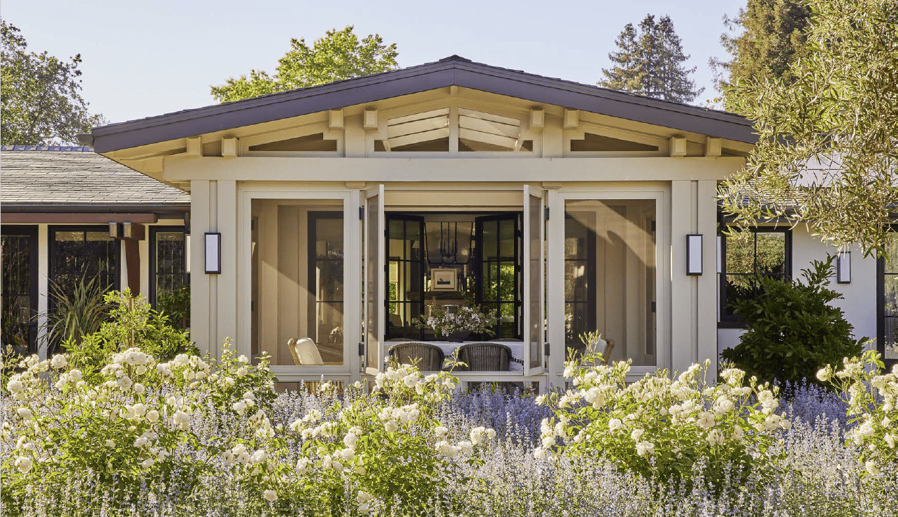
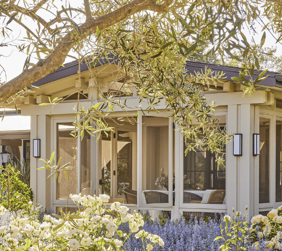
"The house was built, so I have real photos of the house. We want our house to be in different colors, so I have included this below. I think this will help with the renderings.
- Exterior Color: White
- Exterior Roof: Black
- Window and Door casings: Black window and door casings
- Decking/Patio: TimberTech is a sponsor of the house. I'm working with the client to get the color for the decking to be featured.
- Landscaping: Can we see our initial rendering without landscaping? We want it to be different than the images, so I am pulling for you".
 |
 |
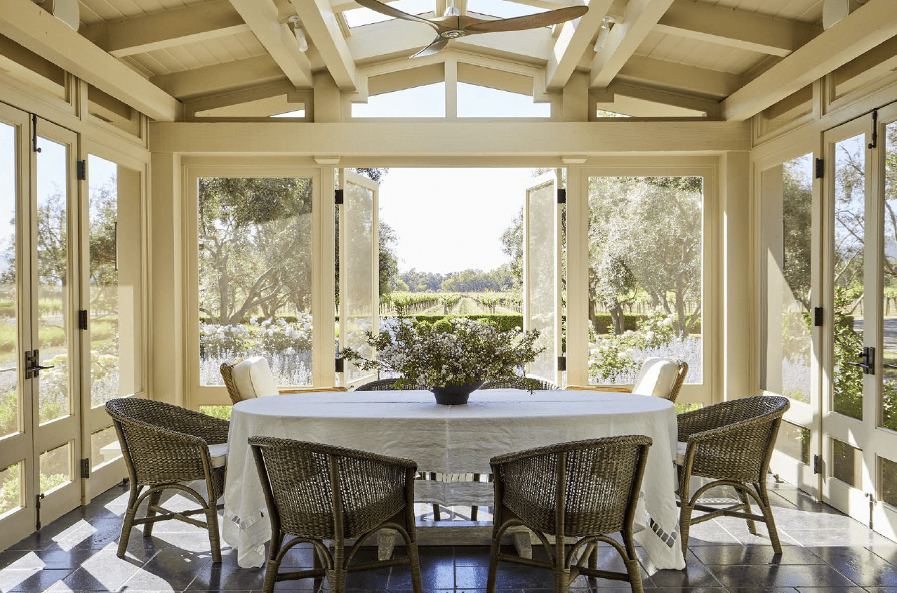 |
Thus, it was one of those rare cases when, in addition to drawings we also had photographs of the finished house.
Phase #2. Clay Model, the First Draft
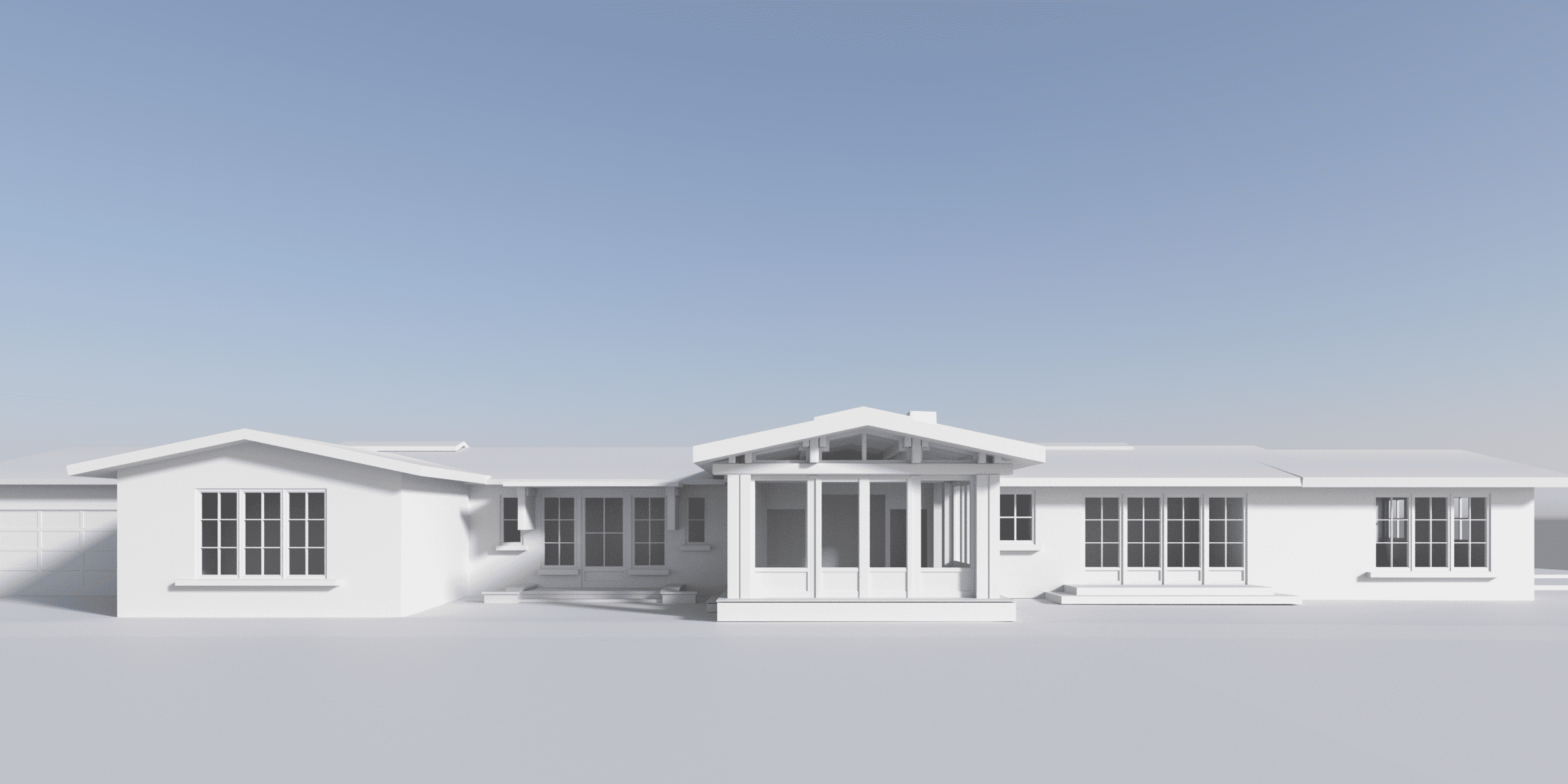
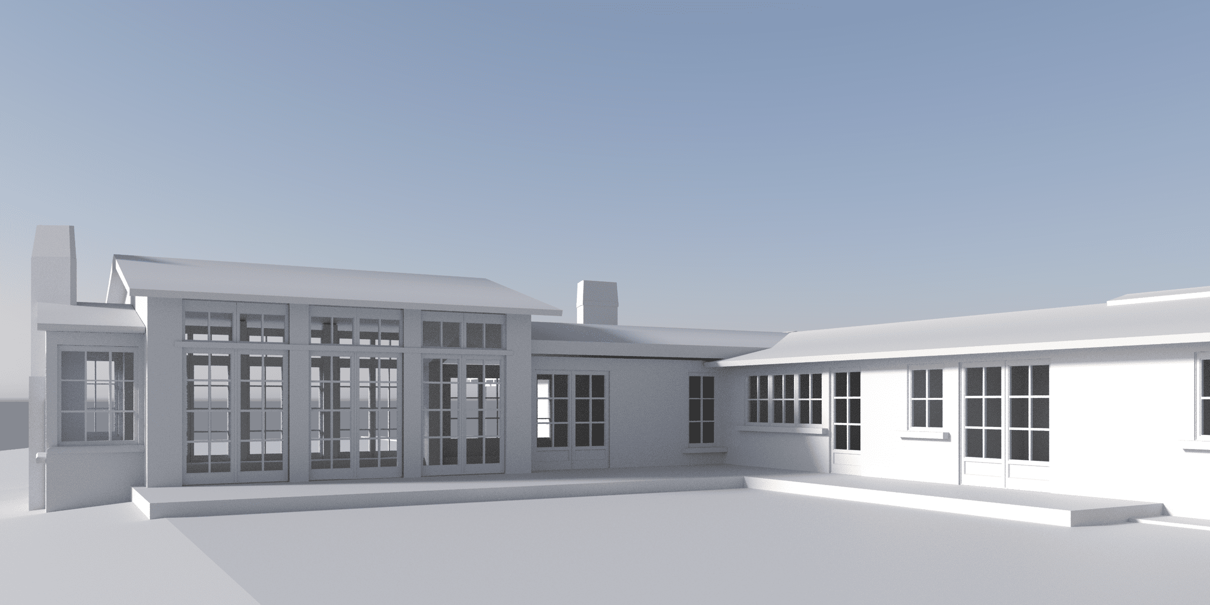
So upon those comments, we started crafting the building with a clay model. After the completion of this step, we sent them over to the customer to ensure everything is correct and asked to choose the desired angles for the final renders.
Our client decided on the angles – she chose to go with the front and side views of the patio.
 |
 |
Phase #3. Exterior 3D Rendering, Second Draft
The next step was much more fun as we started to work with materials and applied them to the model. Meanwhile, we added the environment to our taste, as the client hadn’t yet decided on the wishes for the landscape at that time. So, we placed grass and trees on the visualization that would advantageously set off the facade.
The project was sent to the customer, and based on her response, we realized that we were moving in the very right direction!
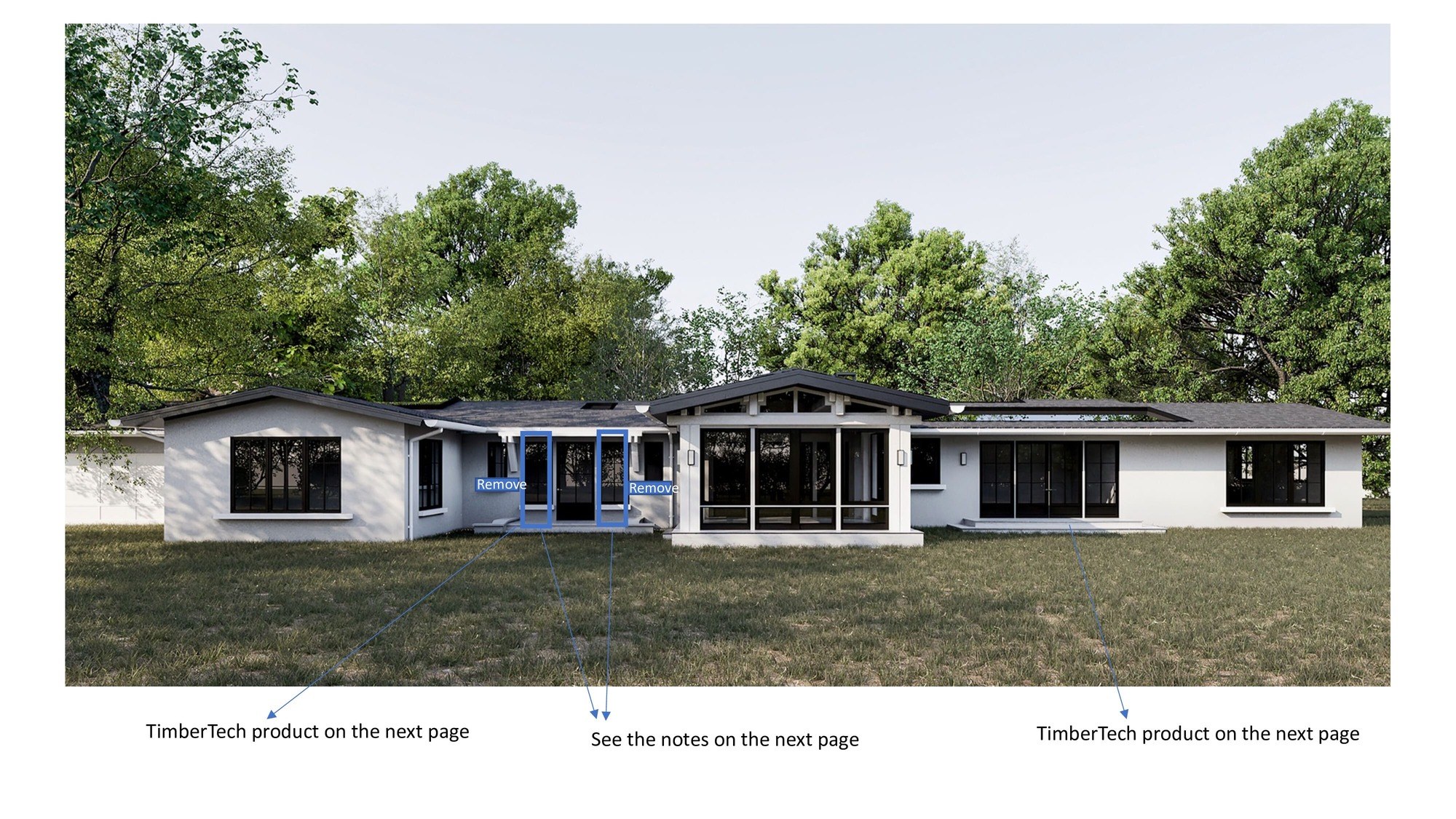
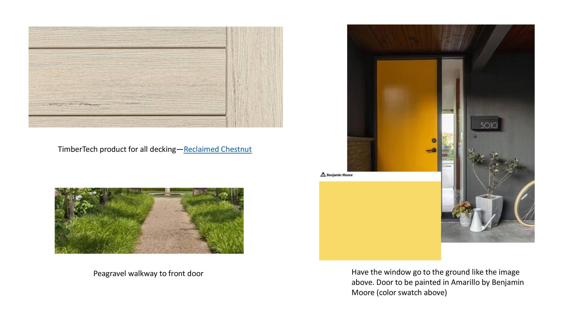
We received some instructions for further work on the project, as well:
 |
 |
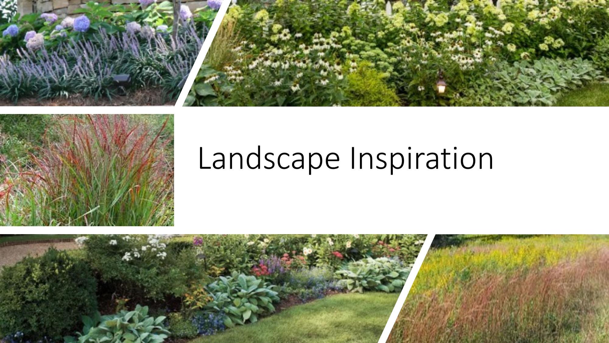 |
And then more instructions and mood boards jumped in! This project was interesting because a lot was being finalized, supplemented, and changed during the work process, so the project was alive.
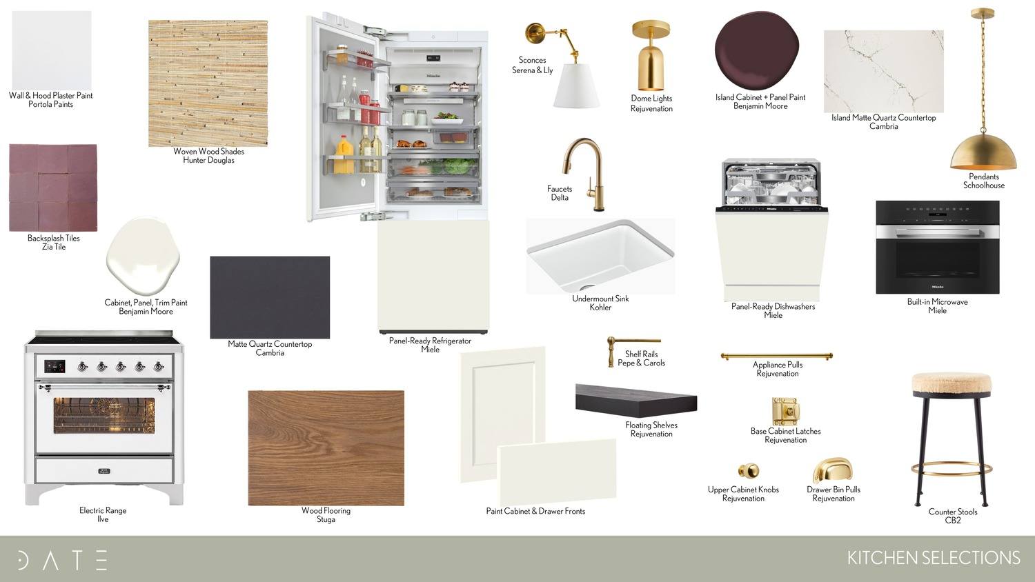 |
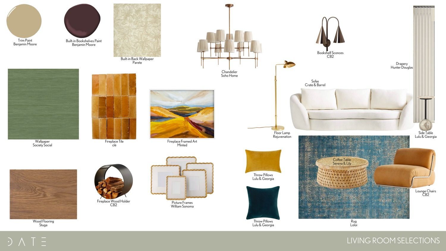 |
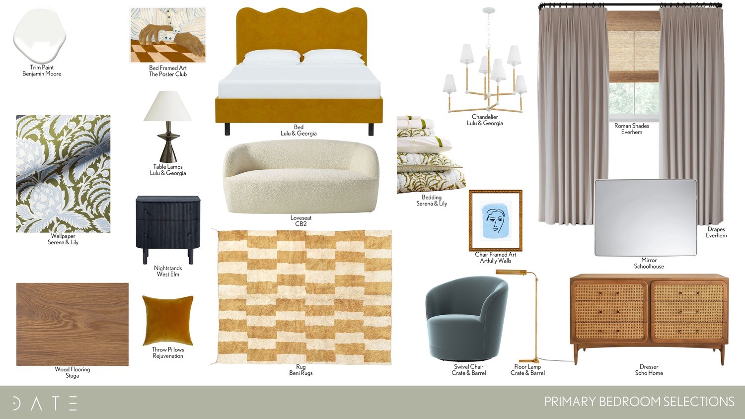 |
Phase #4. Exterior 3D Rendering, Third Draft
At this stage, we already had mood boards and instructions from the customer, so we edited the materials of the facades and changed the landscape following her wishes.
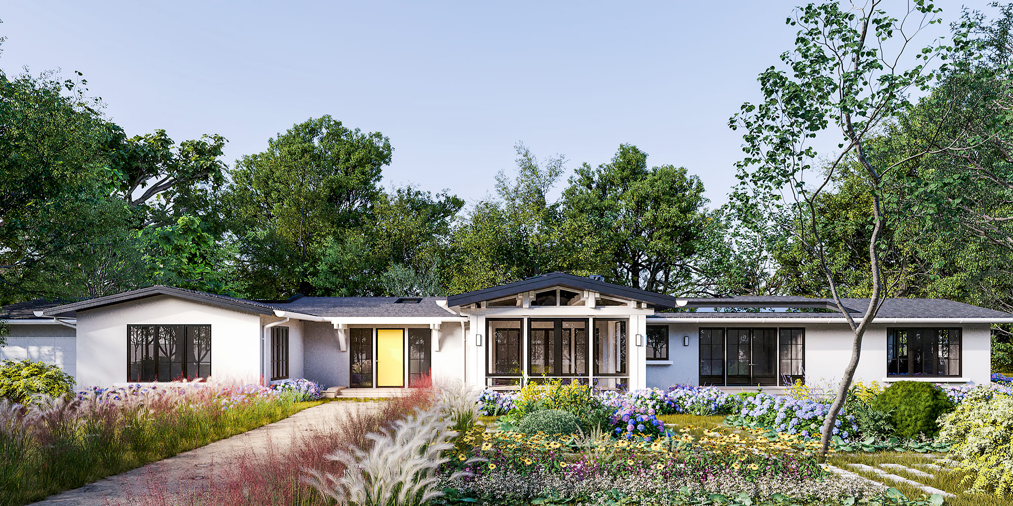 |
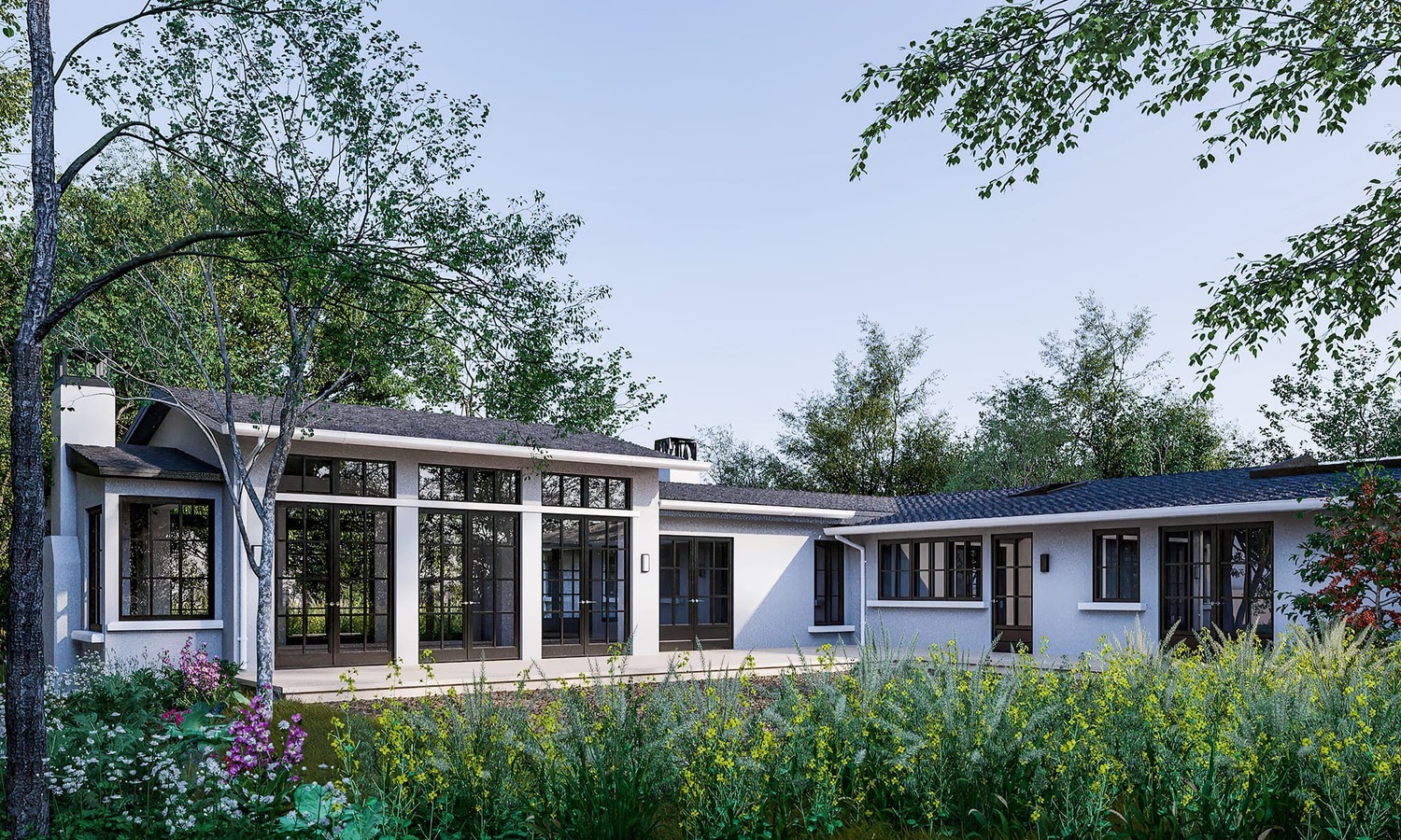 |
In response, we received a few comments for further work:
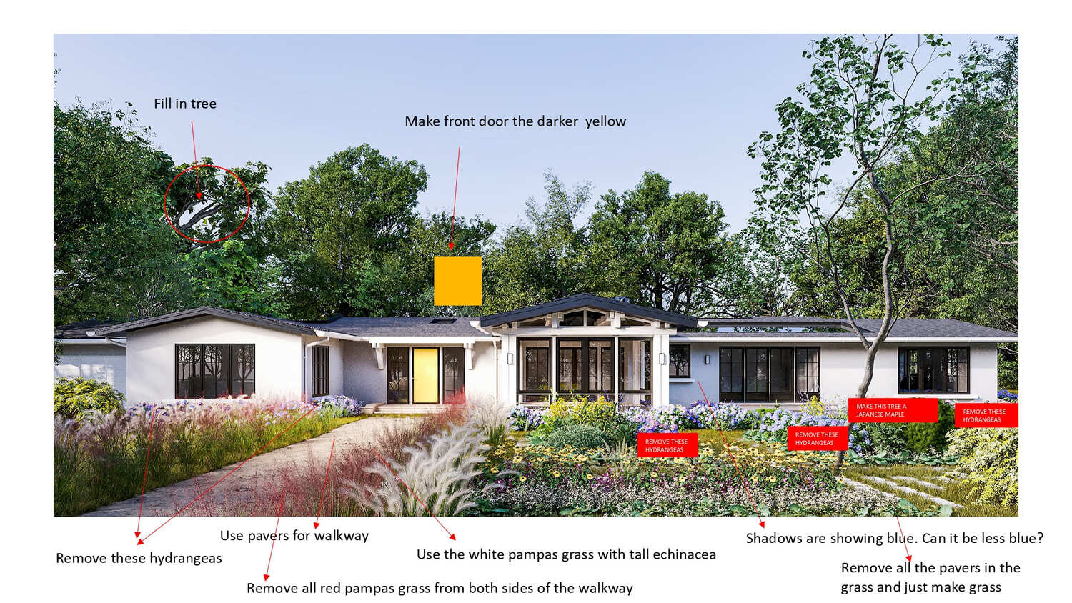 |
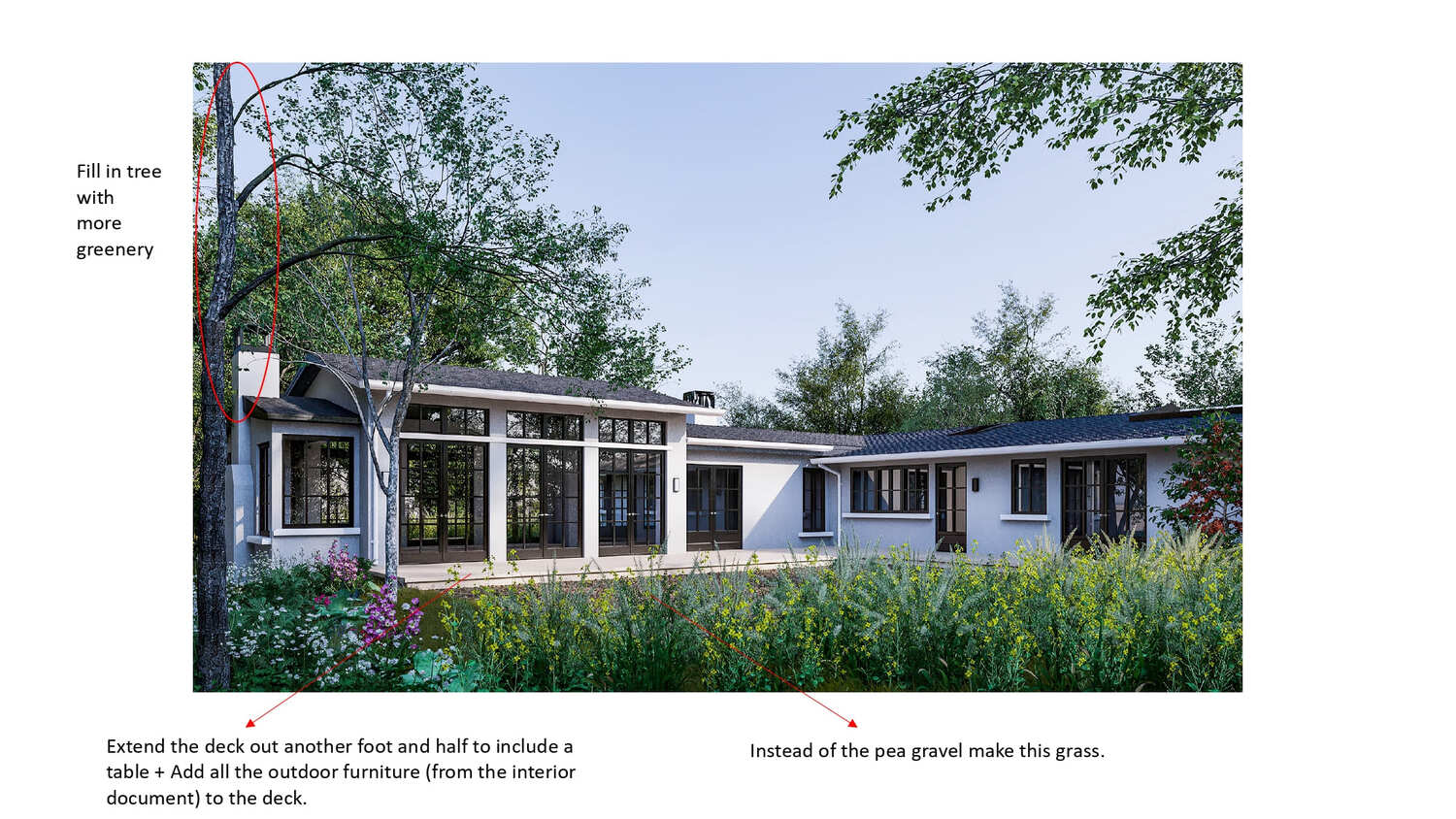 |
Phase #5. Interior 3D Rendering, First Draft
When the general concept of the exteriors was approved, we could proceed to the most exciting part - take a look inside our house. The client sent this floor plan for our designers to understand how the furniture should be located.
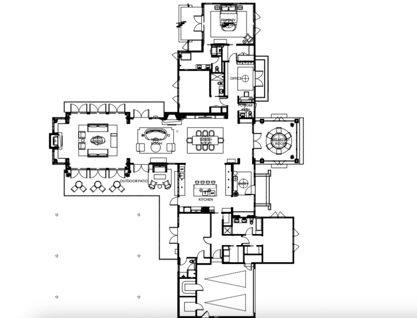
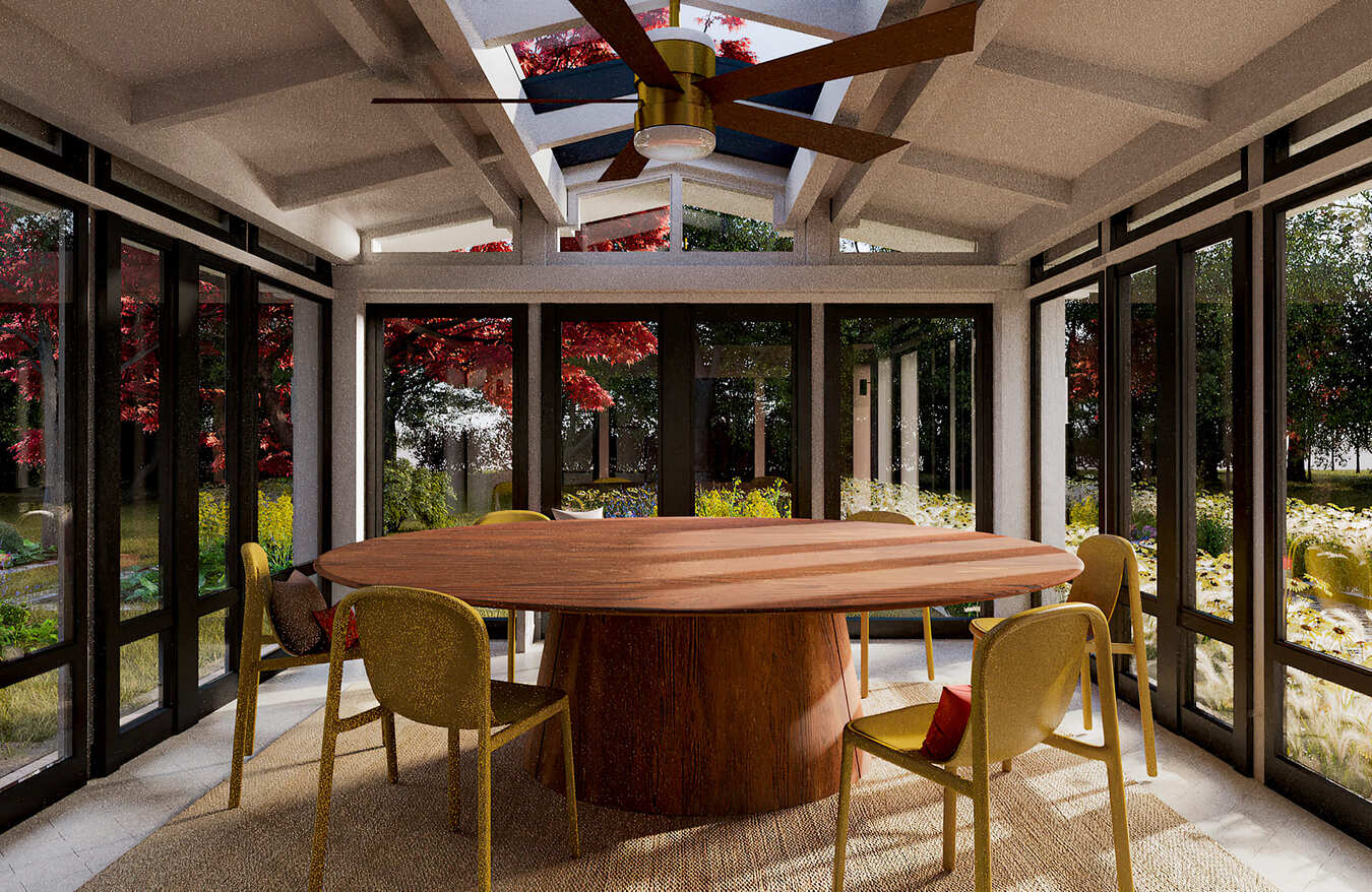
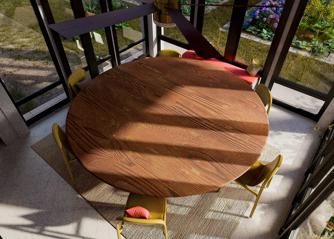
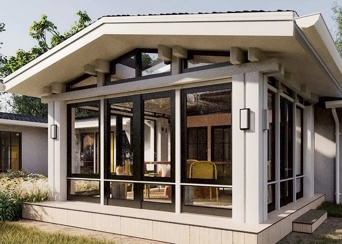
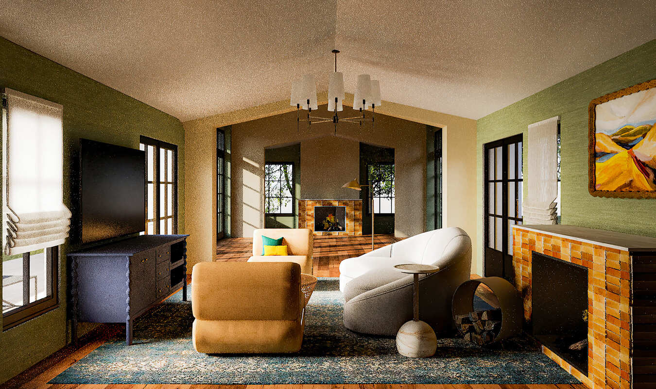
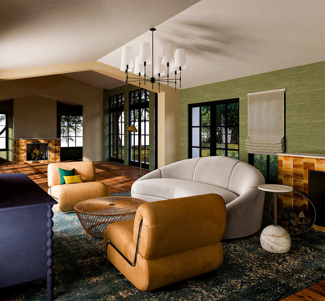
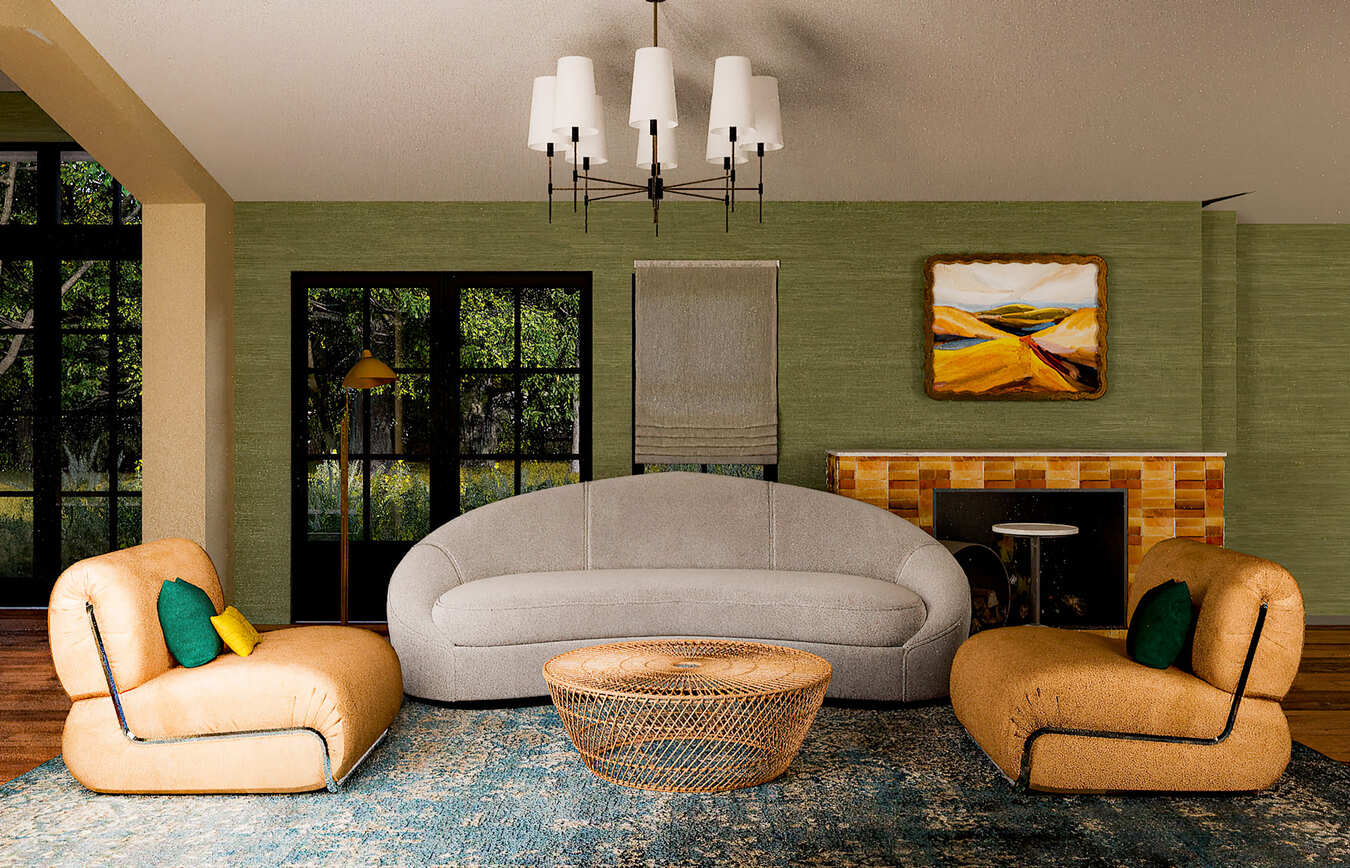
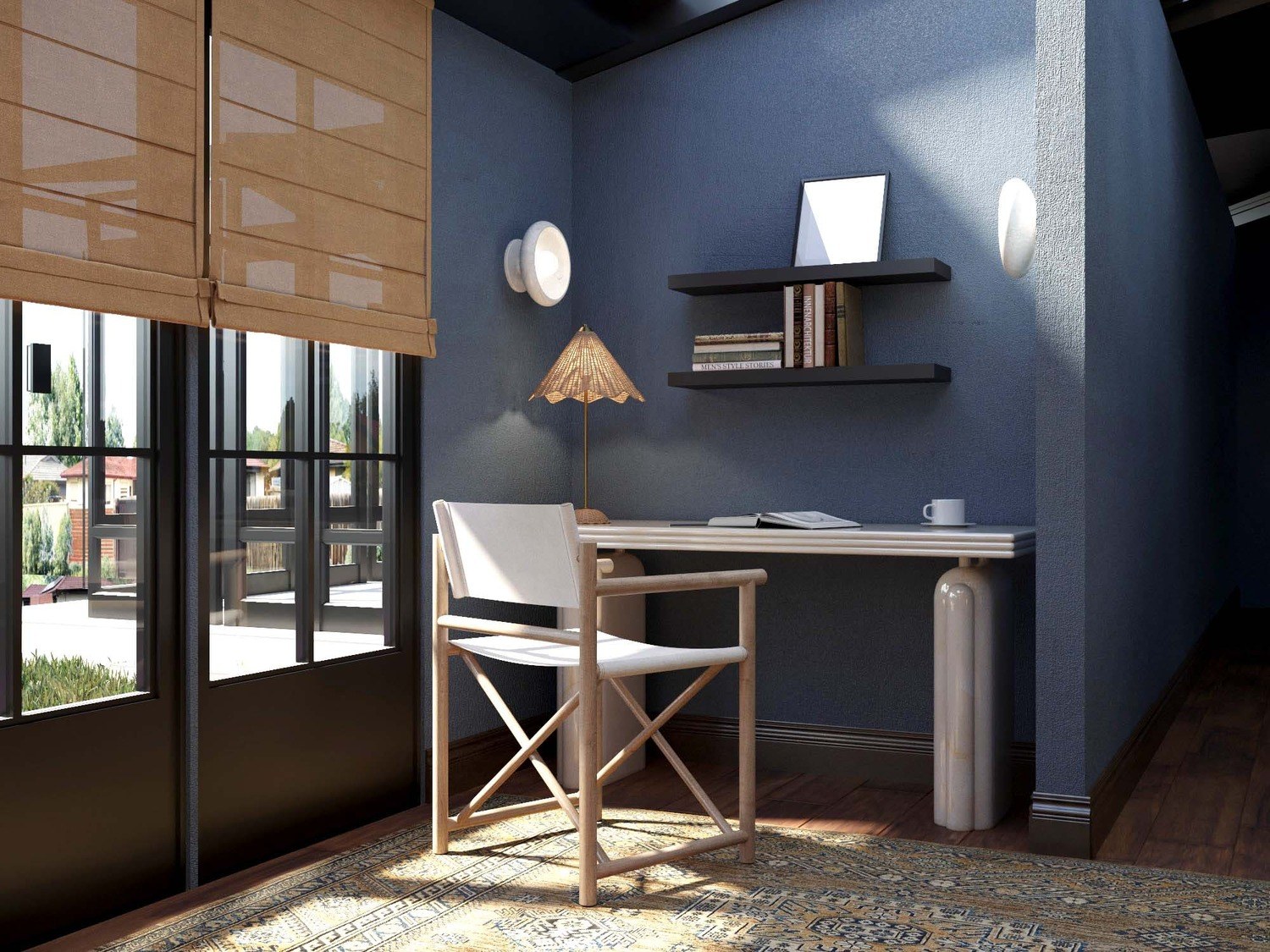
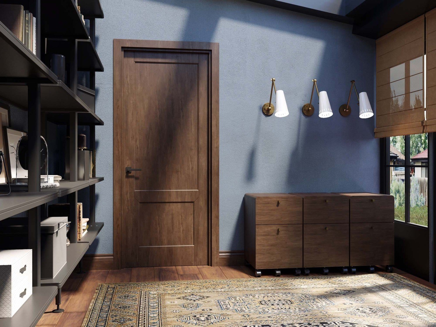
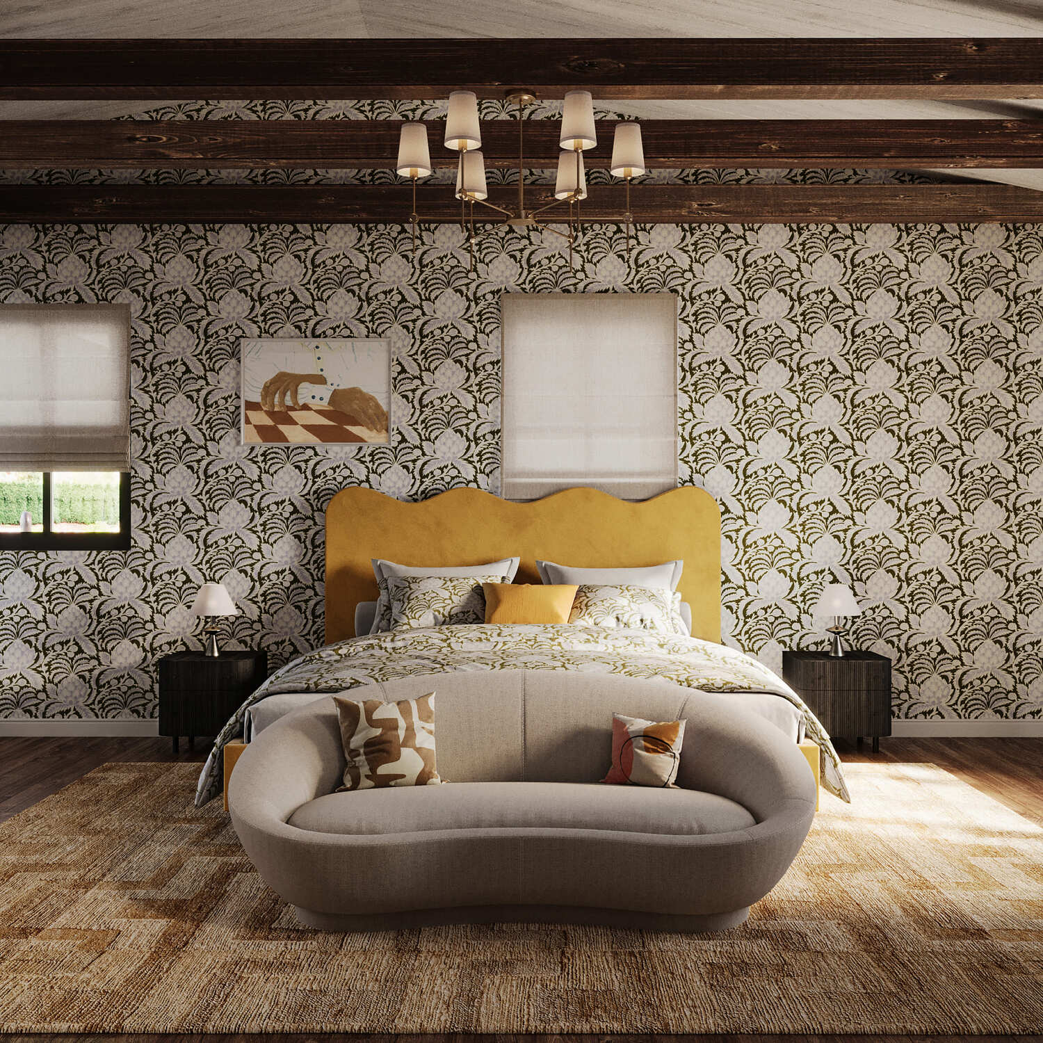
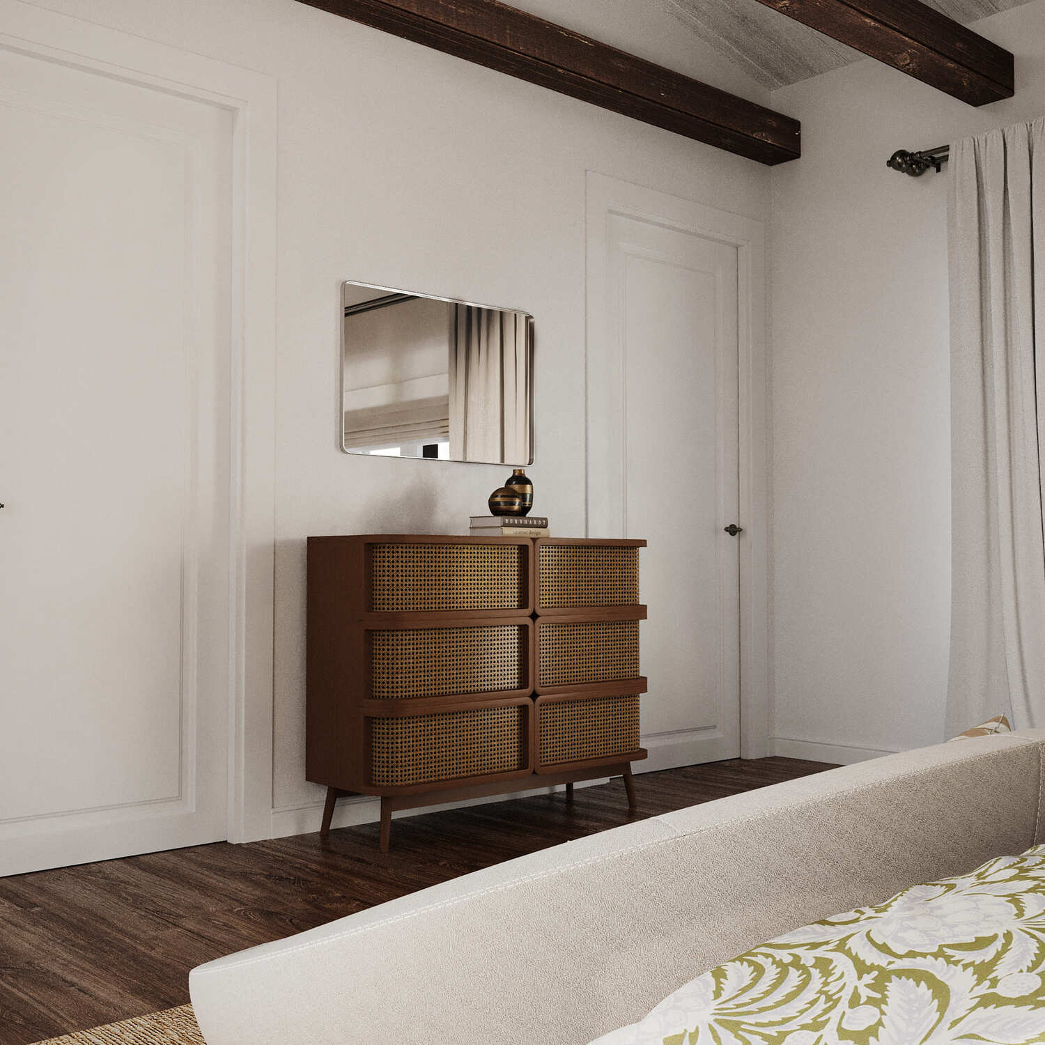
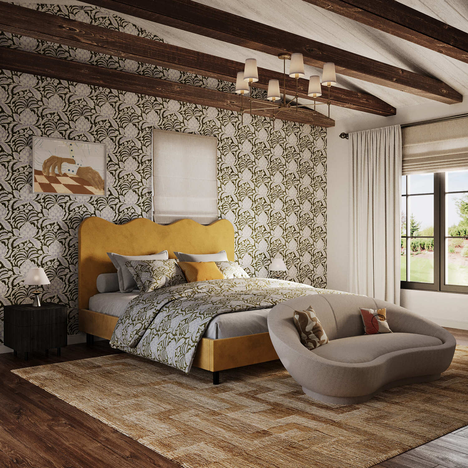
Focusing on these schemes, as well as on mood boards, in just a day, we prepared the first renderings for some rooms. These pictures can be considered a preview to determine the overall style of the premises. Here's what we got:
Breakfast room
 |
 |
 |
Media Room
 |
 |
 |
Office
 |
 |
Bedroom
 |
 |
 |
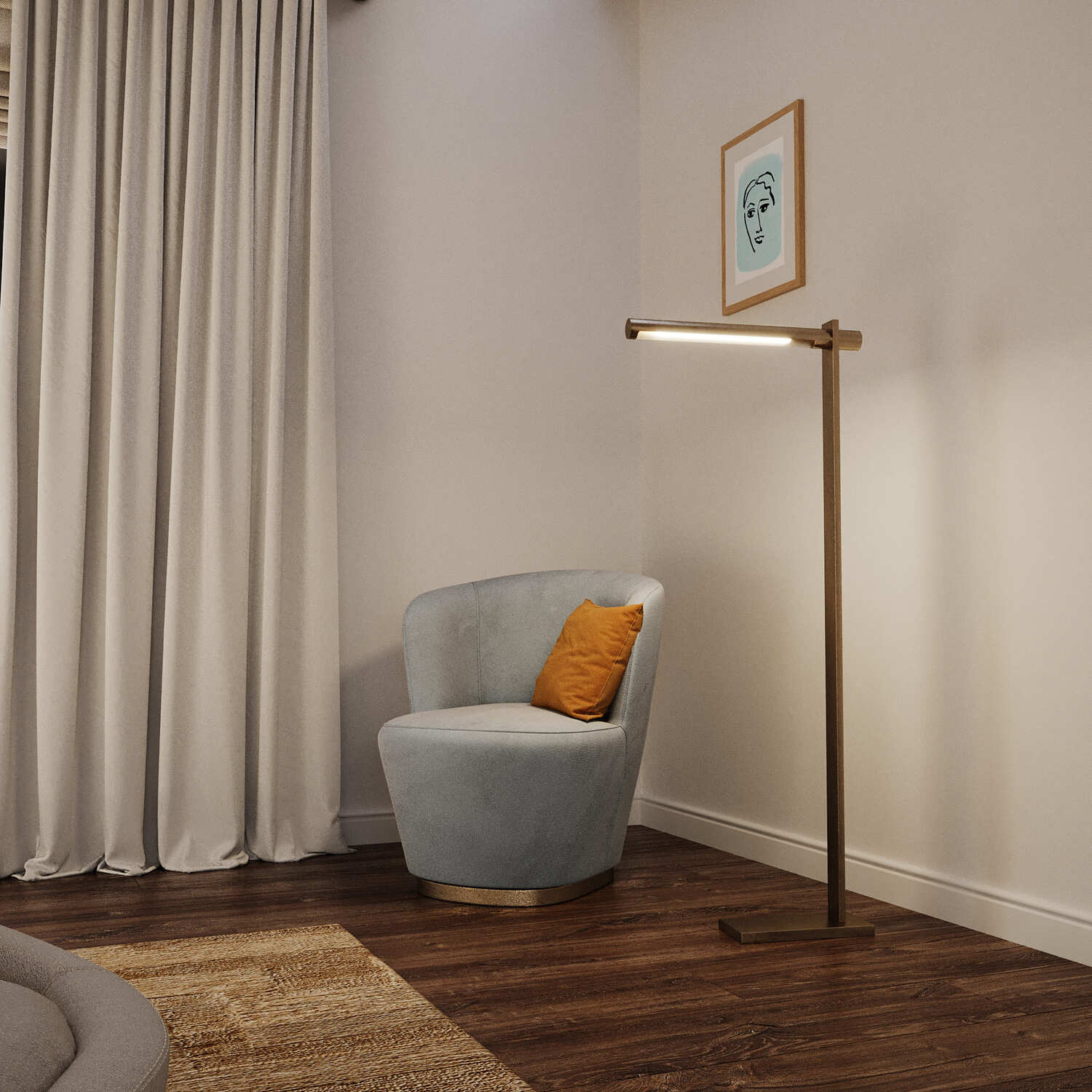 |
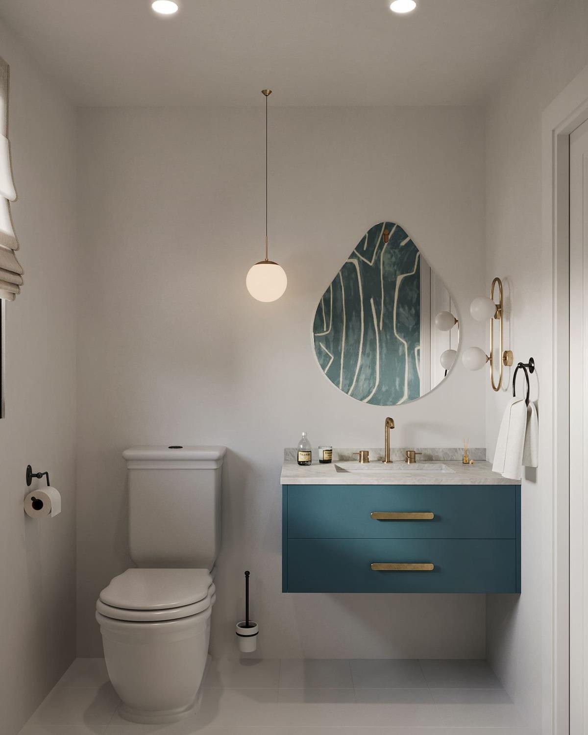
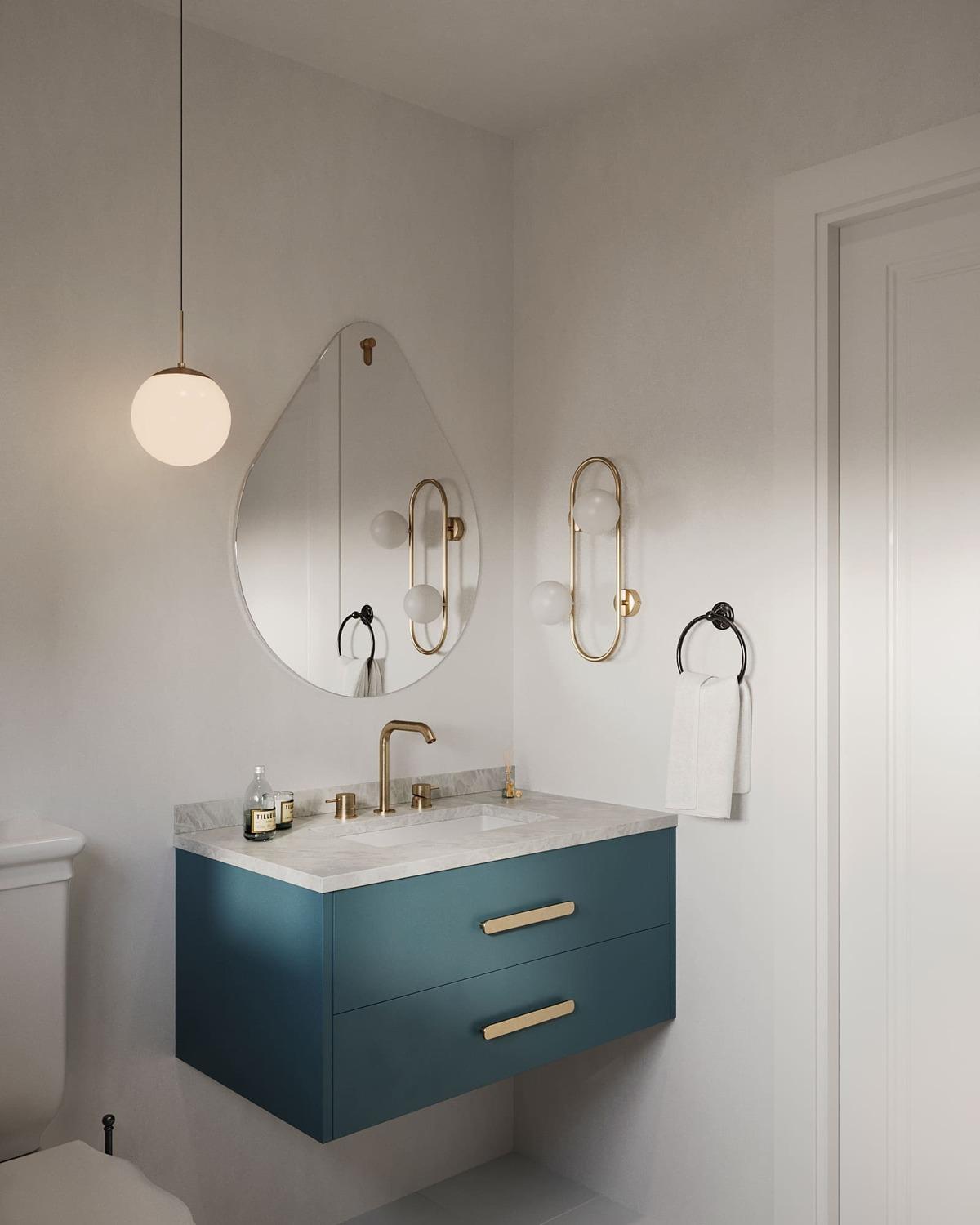
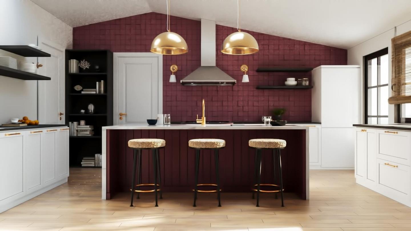
The next day, we had a few more rooms ready:
Powder Bath
 |
 |
Kitchen
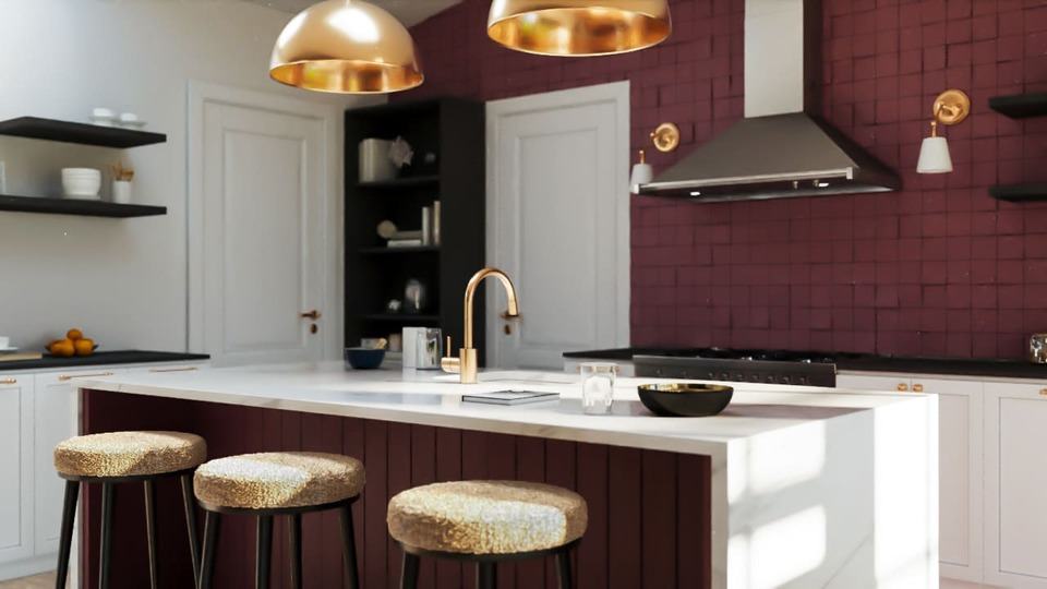 |
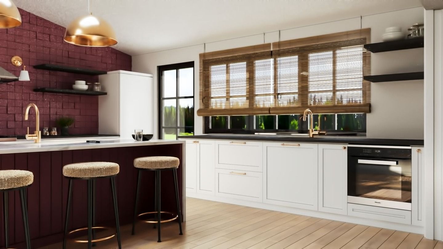 |
Soon we received a document with edits from the client. Some of them were very easy, just a couple of strokes, while others required serious work from our team:
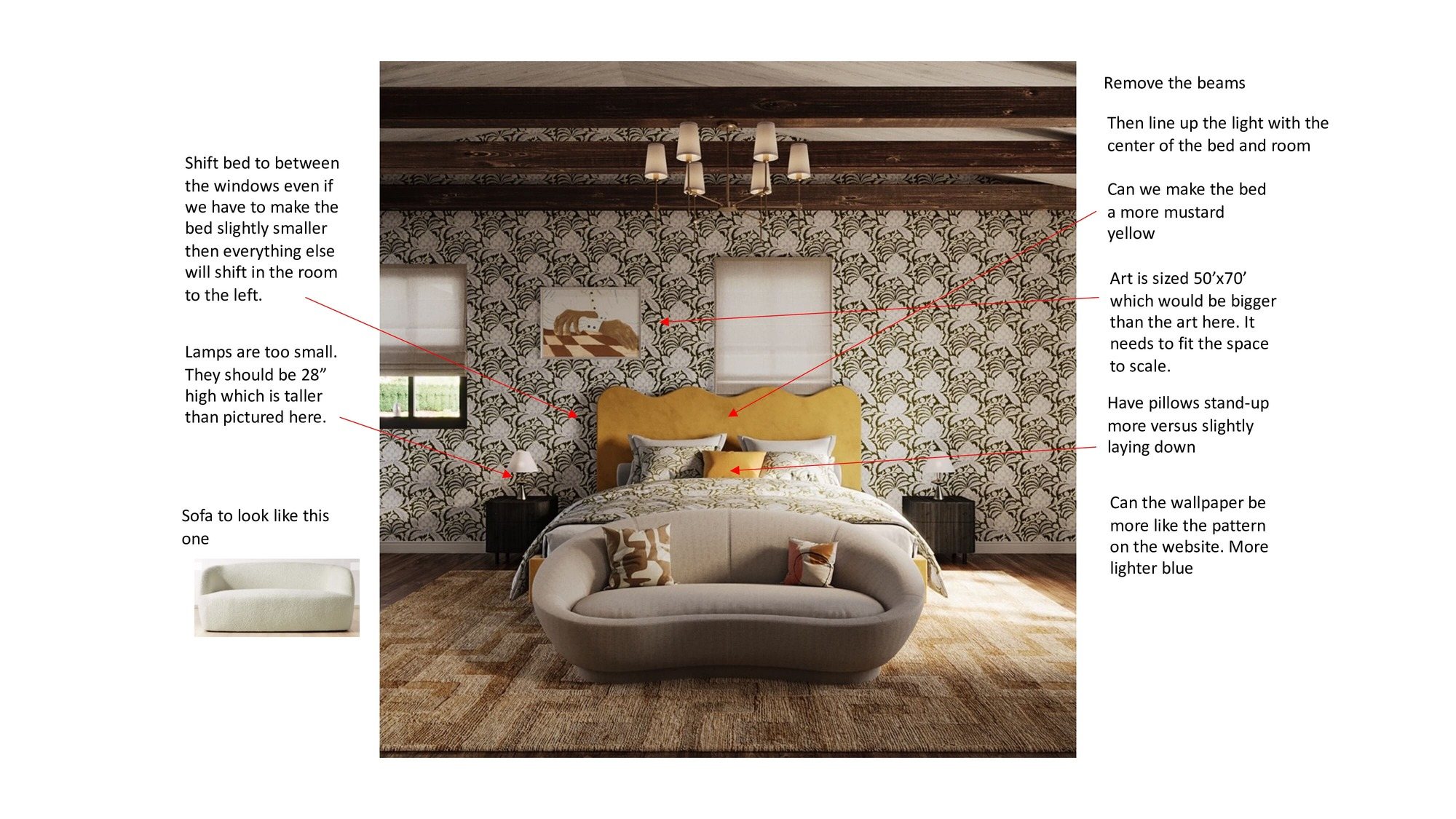 |
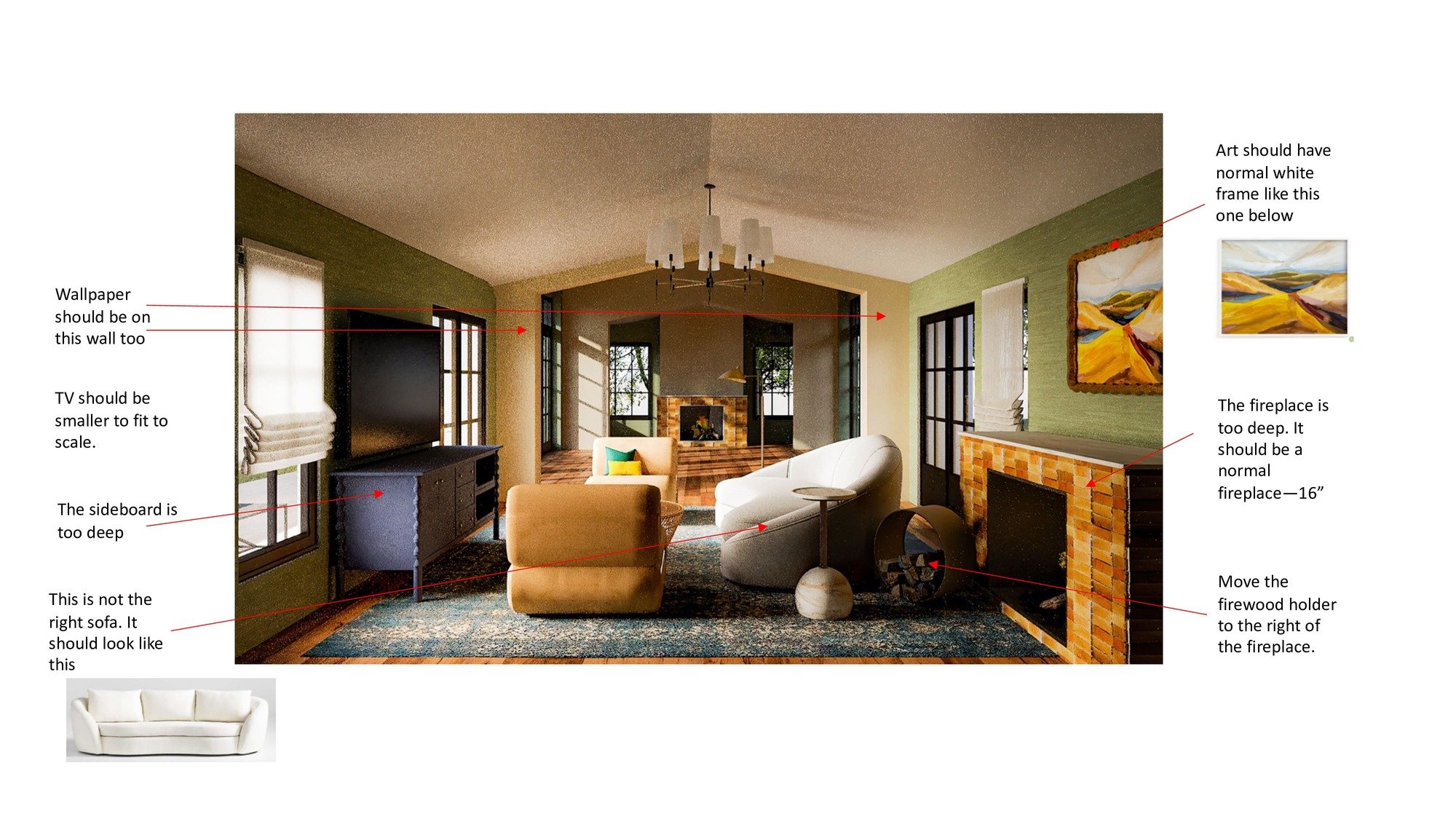 |
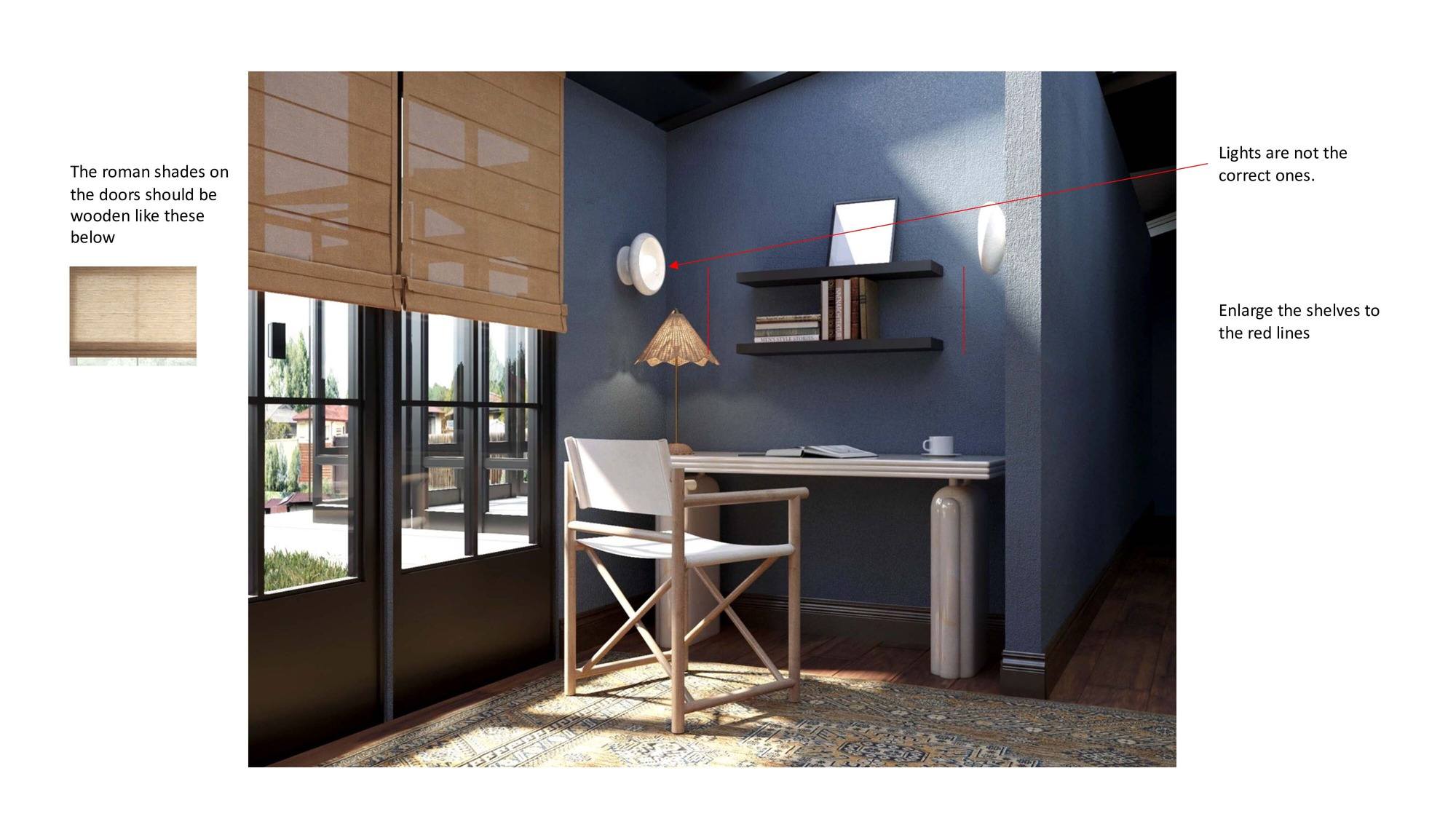 |
Not all the pieces of furniture that the customer pointed out to us in the edited document had 3D models - therefore, at the this stage our team of 3D modelers stepped in.
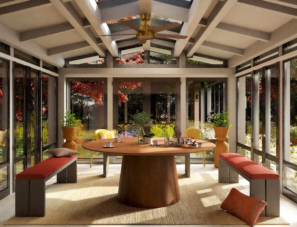
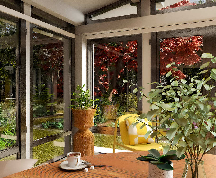
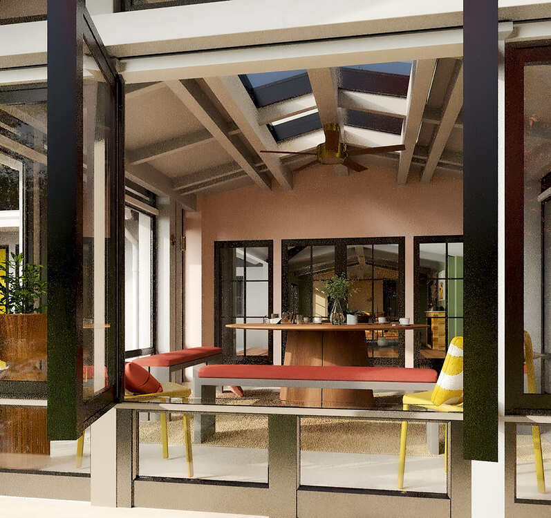
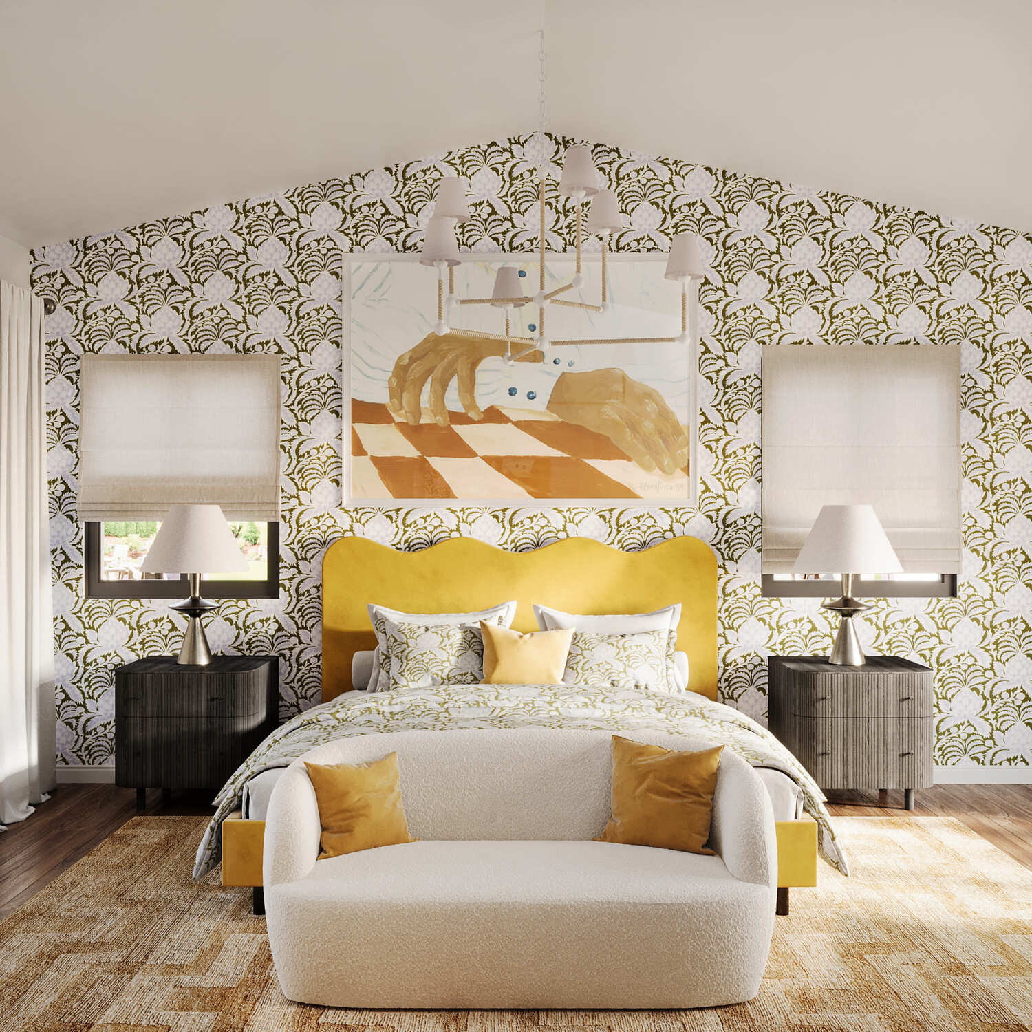
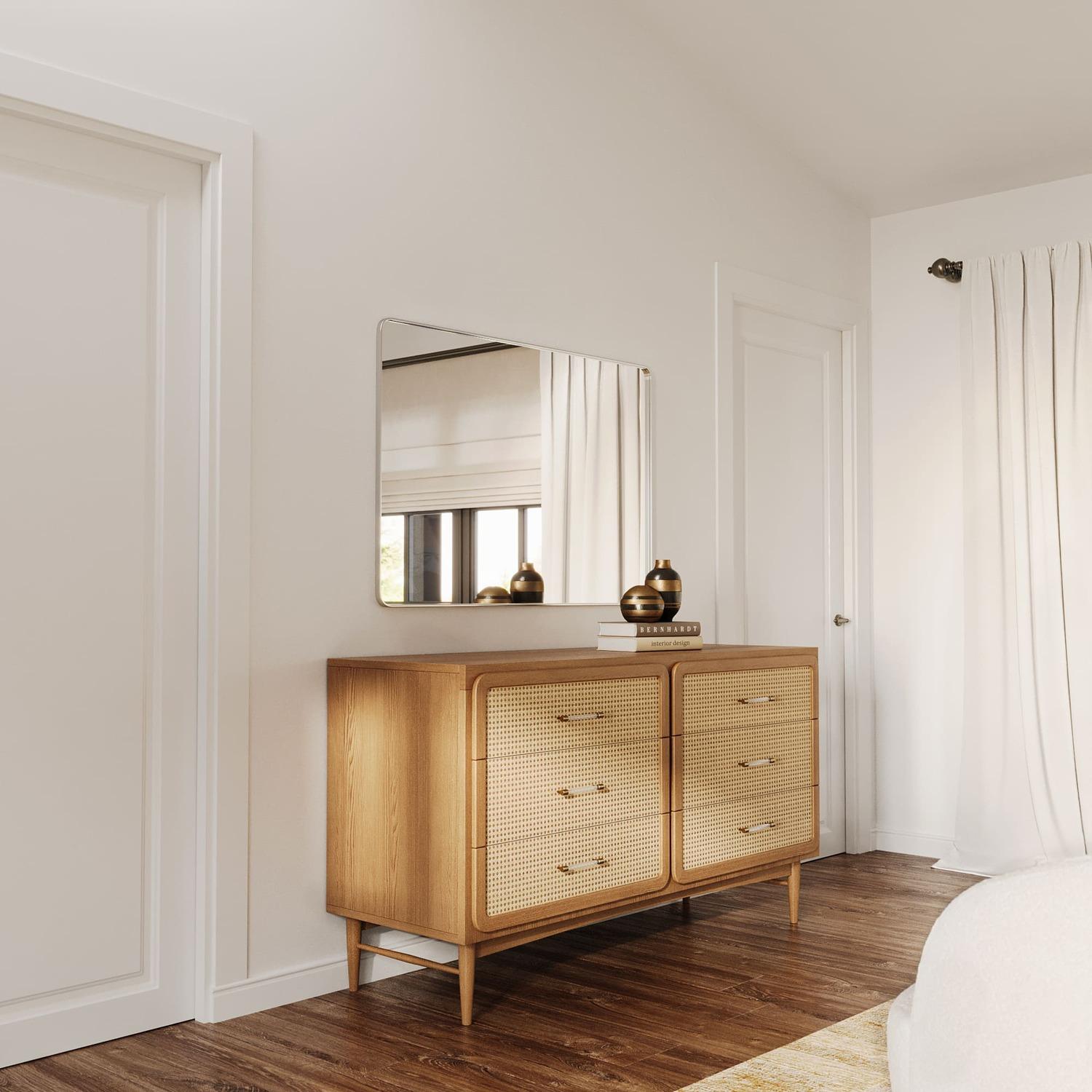
We asked them to make 3D models of a chandelier, a sofa, a side table, a toilet, a chest of drawers, all the furniture in the breakfast room, and more.
This way we could craft the new renders using these models too.
Breakfast Room
 |
 |
 |
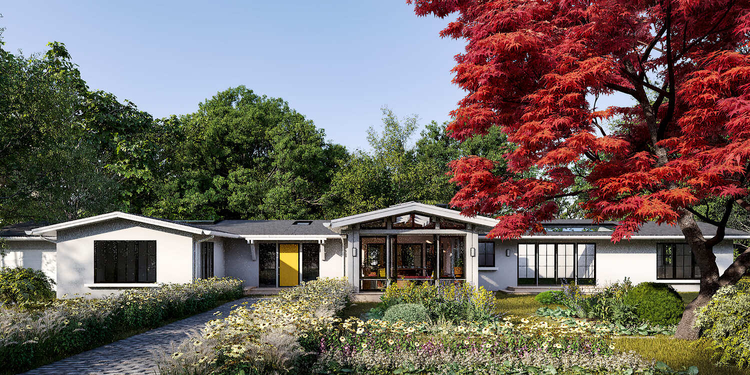
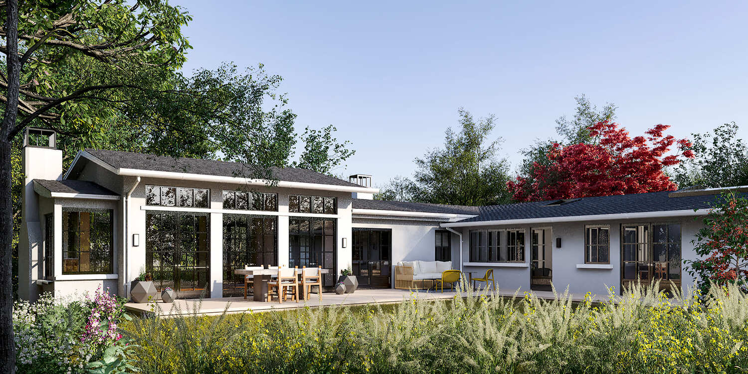
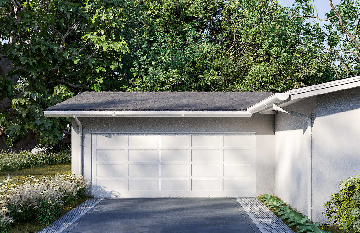
Exterior, patio
 |
 |
 |
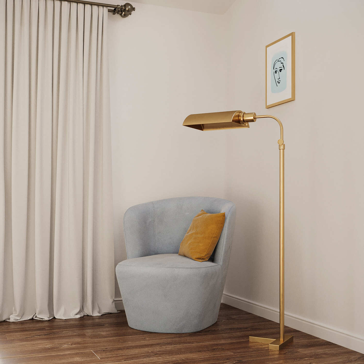
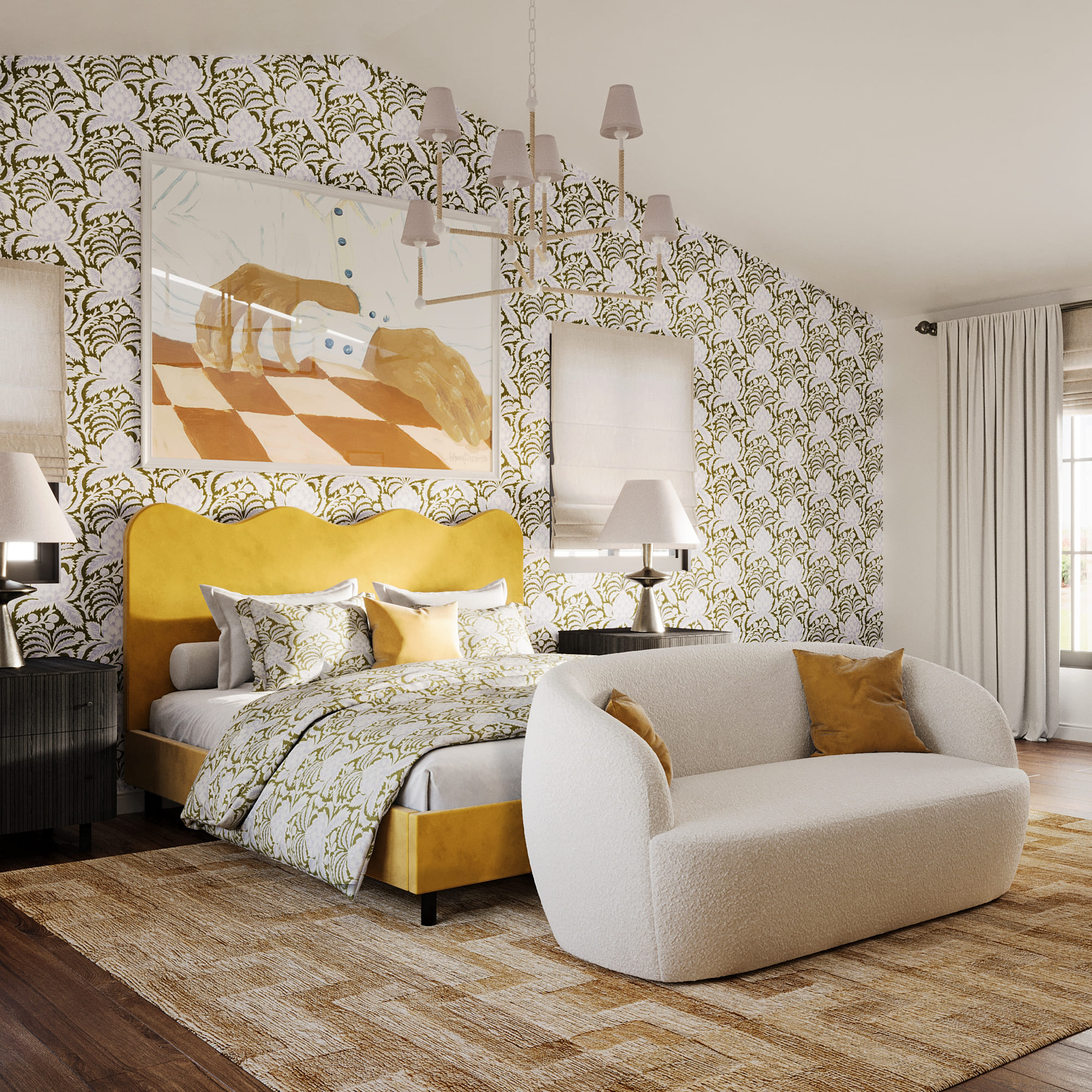
Bedroom
 |
 |
 |
 |
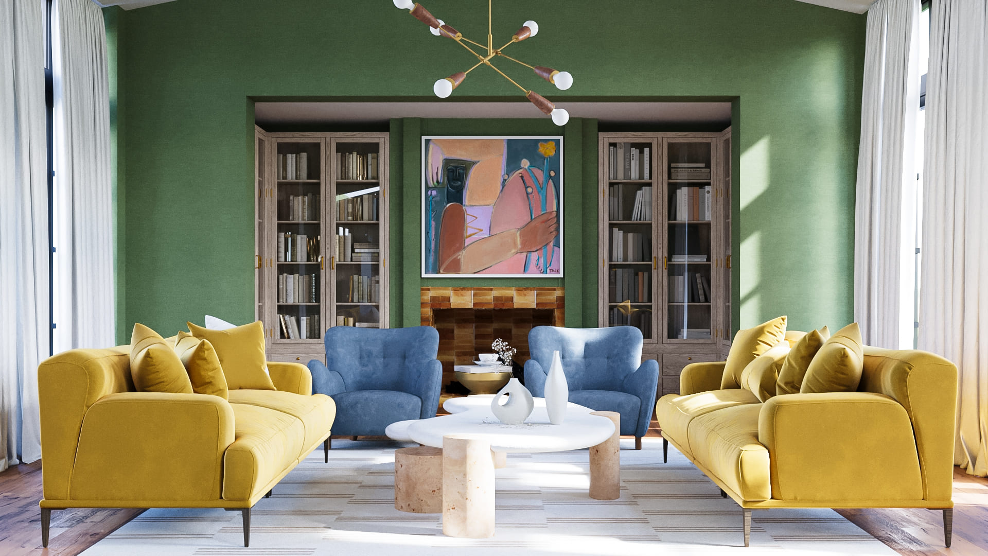
Great Room
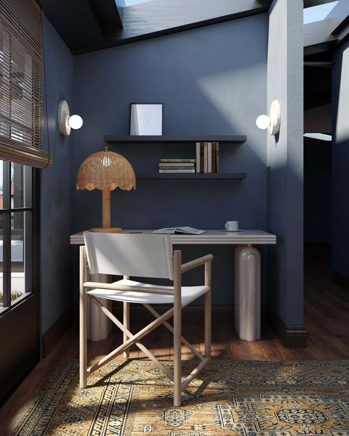
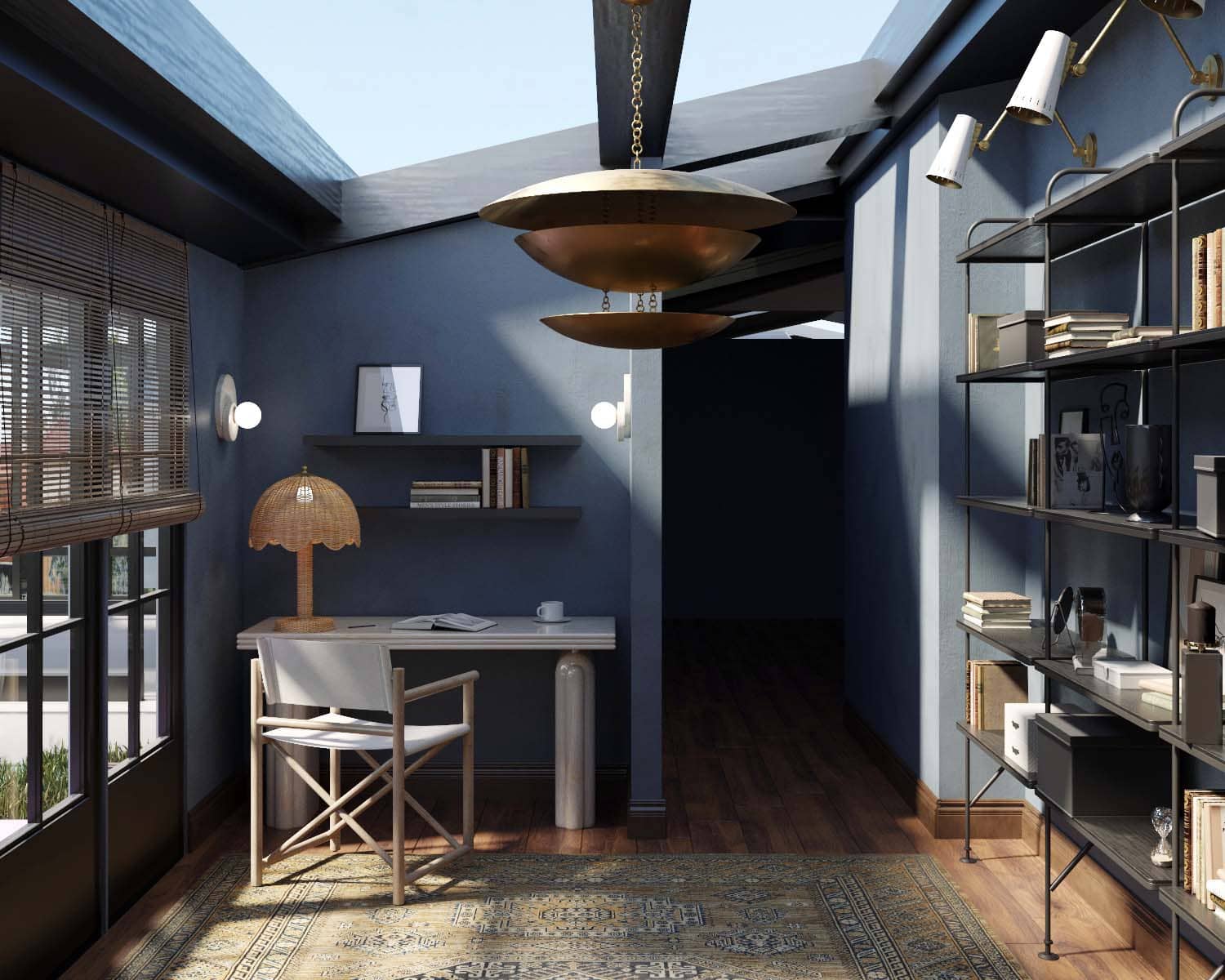
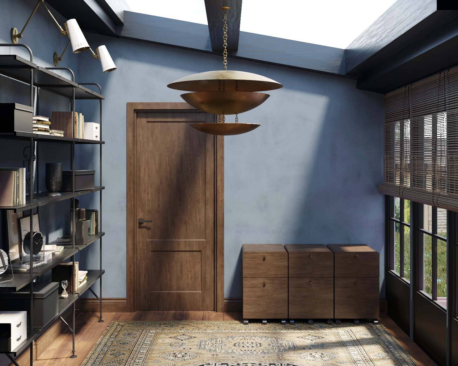
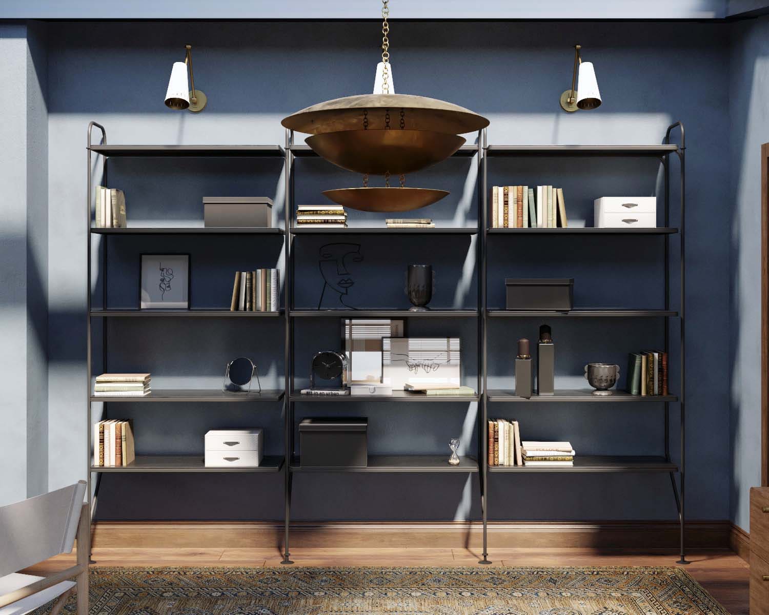
Office
 |
 |
 |
 |
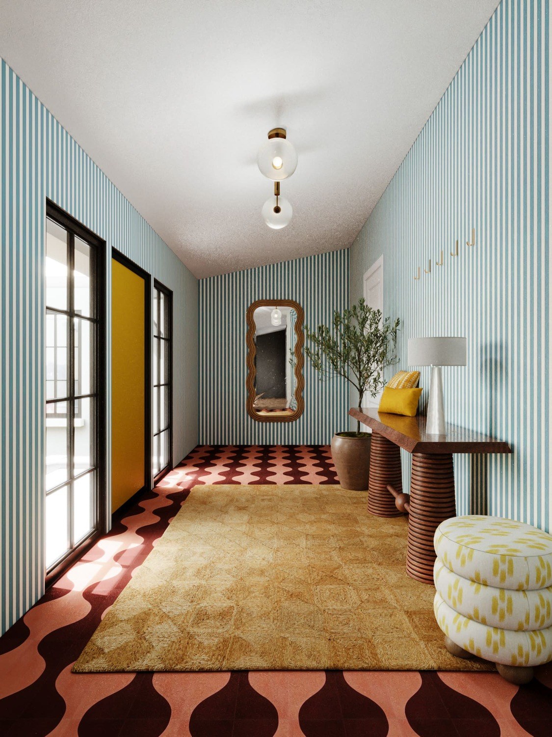
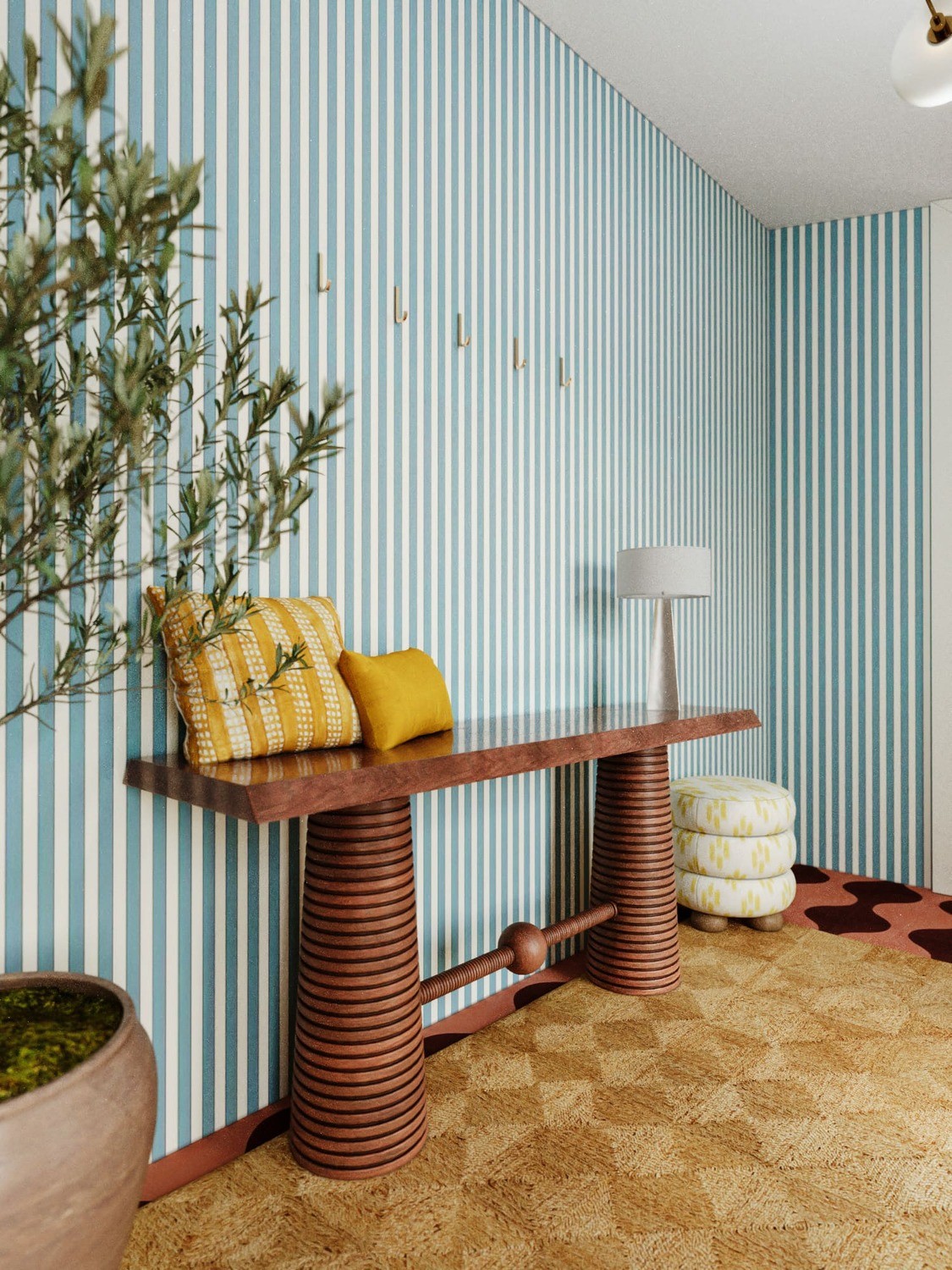
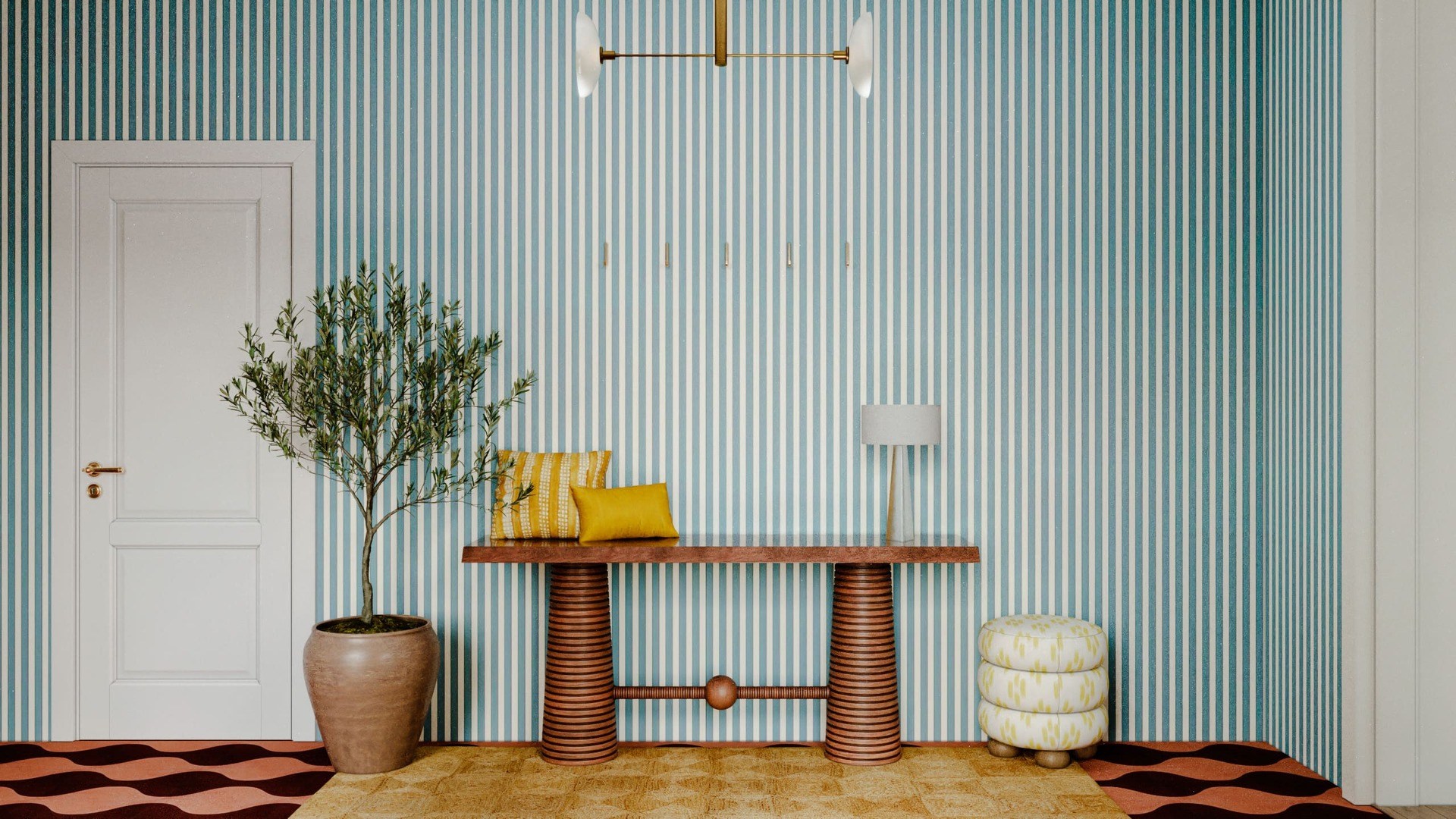
Lobby
 |
 |
 |
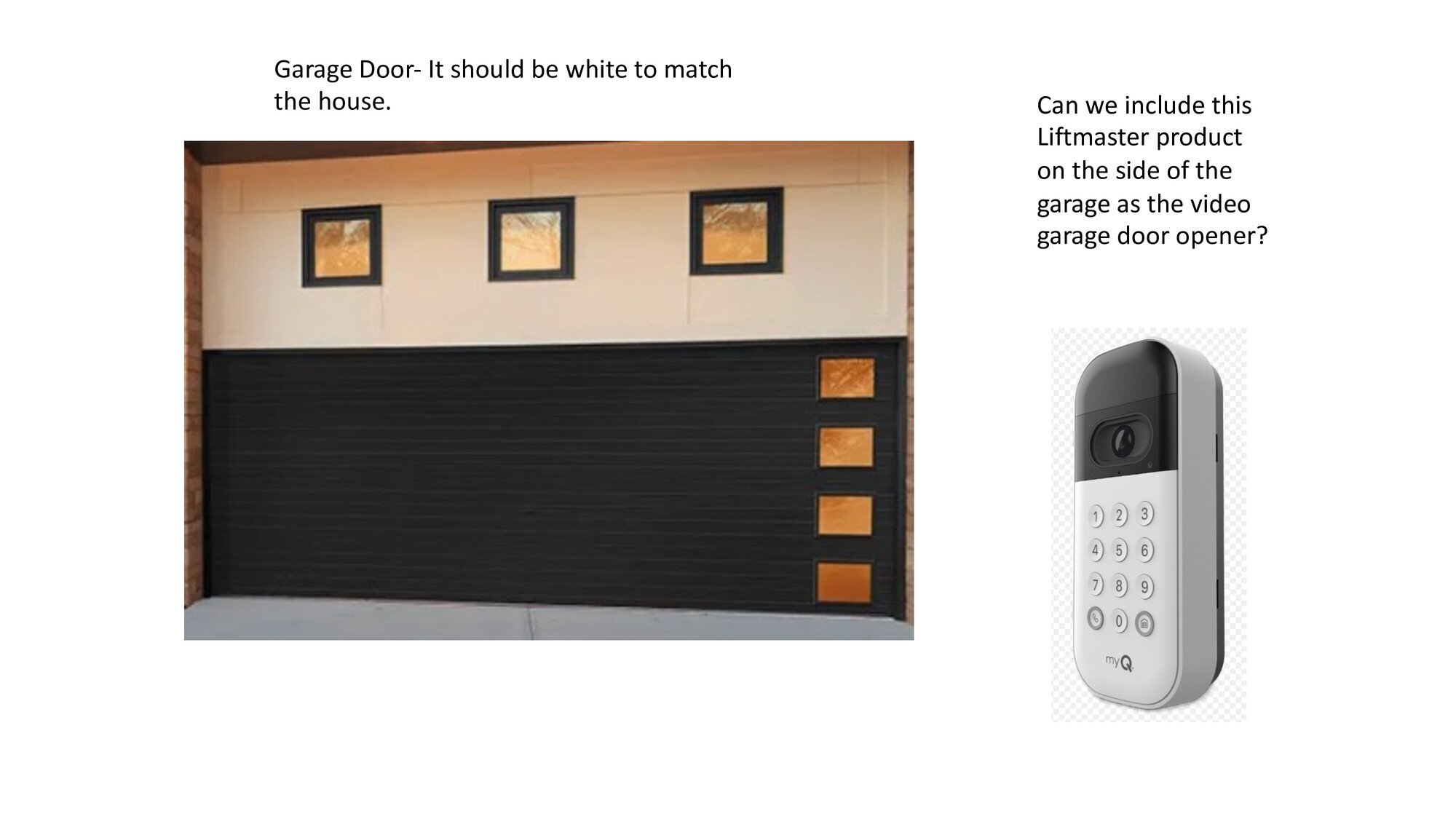
We sent these visualizations to the client and gave her a few questions we had during the process. And soon, we received a document with answers:
 |
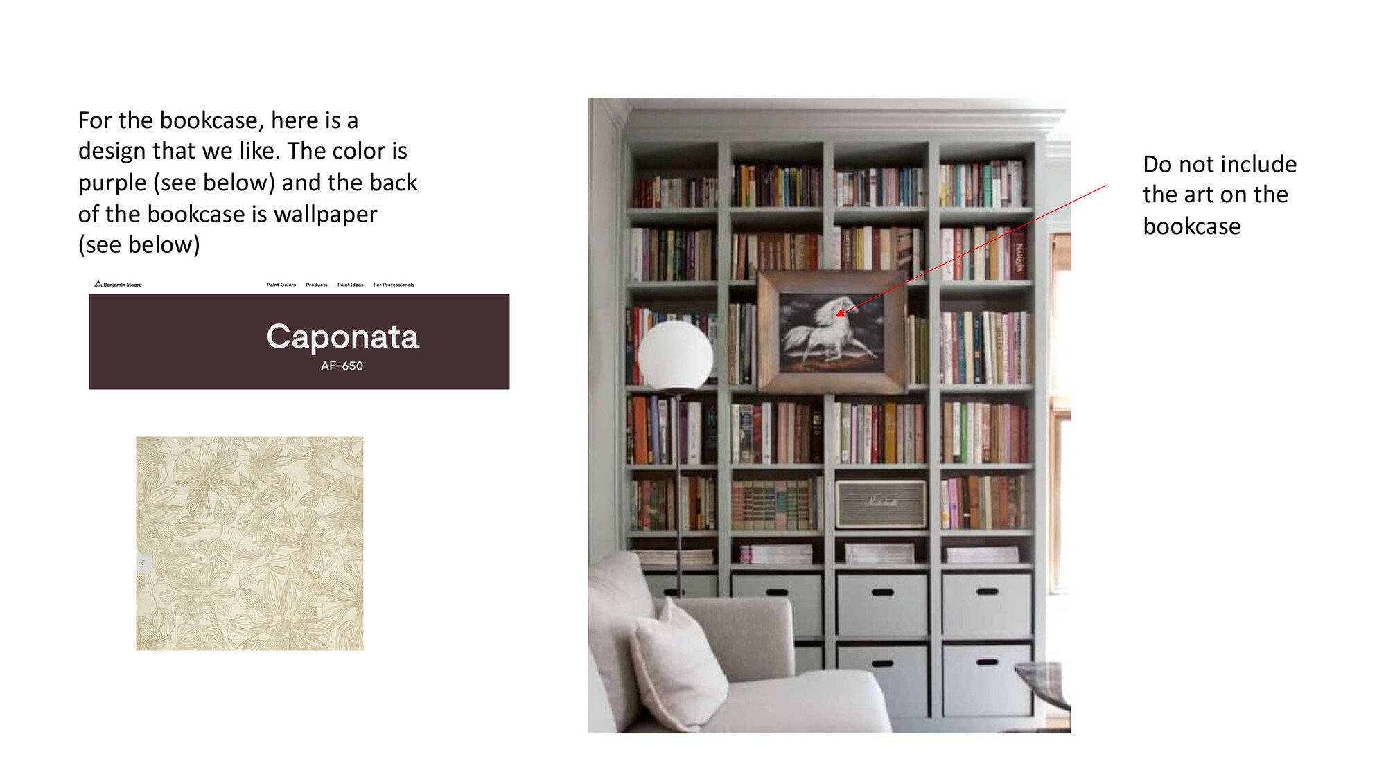 |
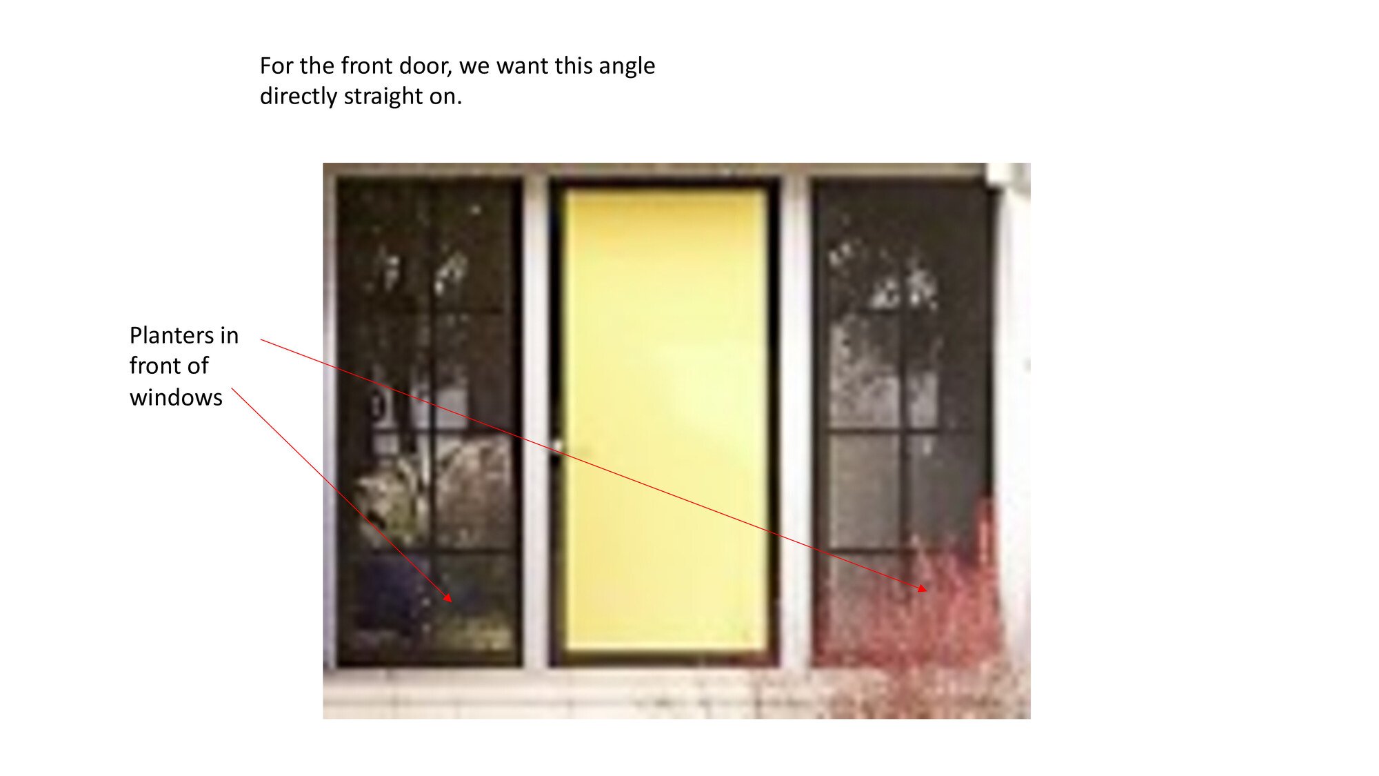 |
So, we sent all the ready images and soon received a feedback. The client presented all his wishes and comments in the form of a presentation:
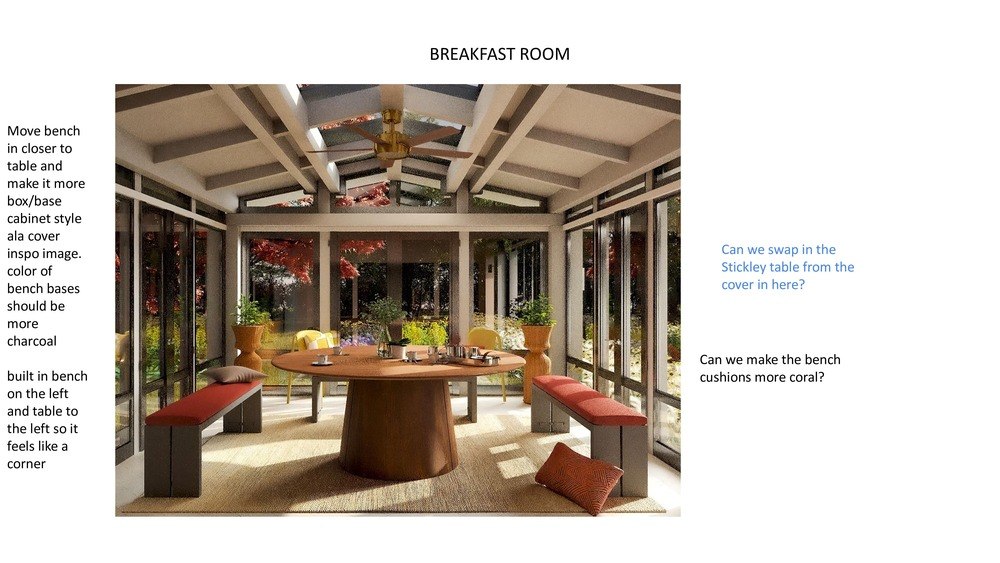 |
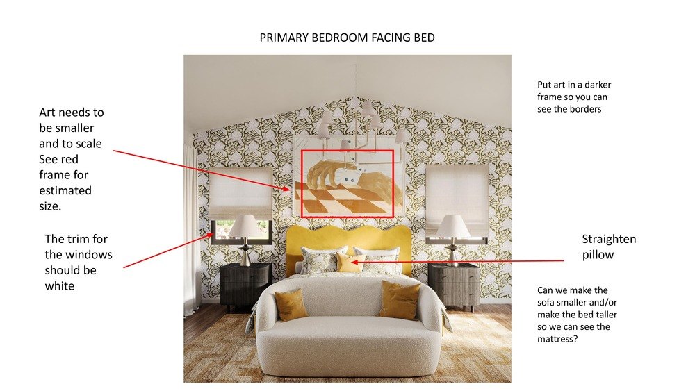 |
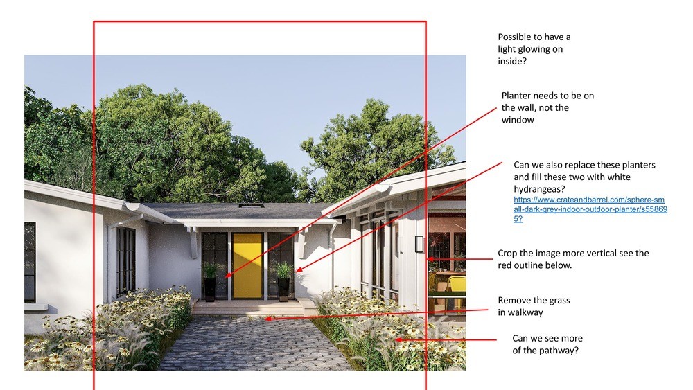 |
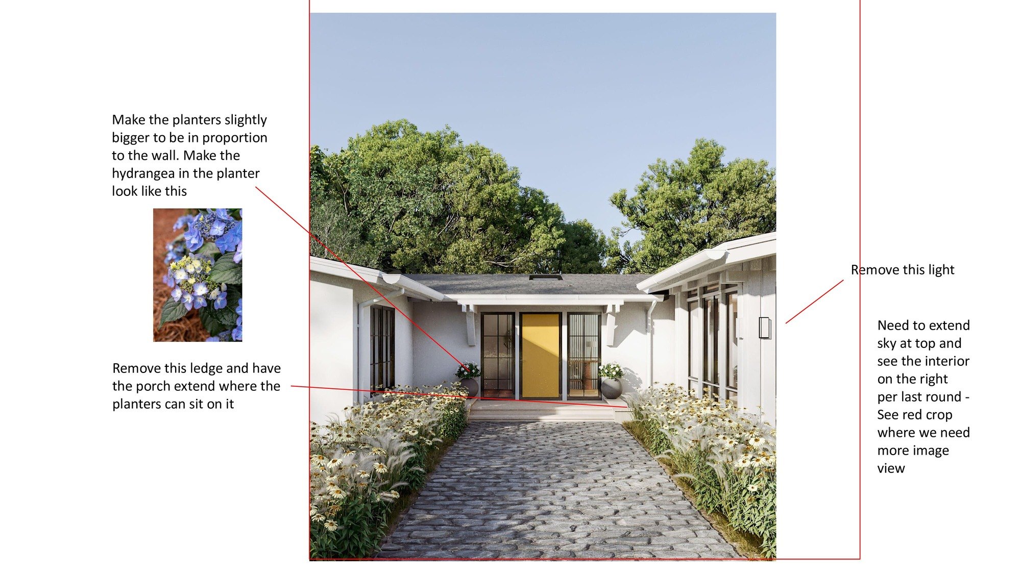
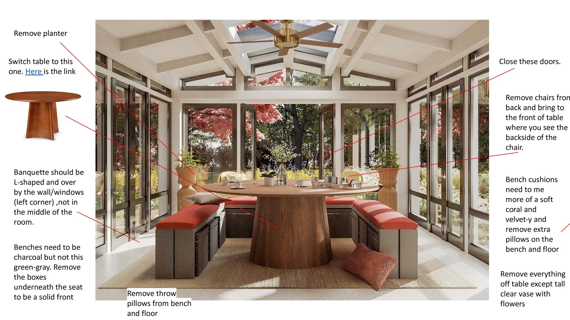
We sent them to the client and received response comments on the same day:
 |
 |
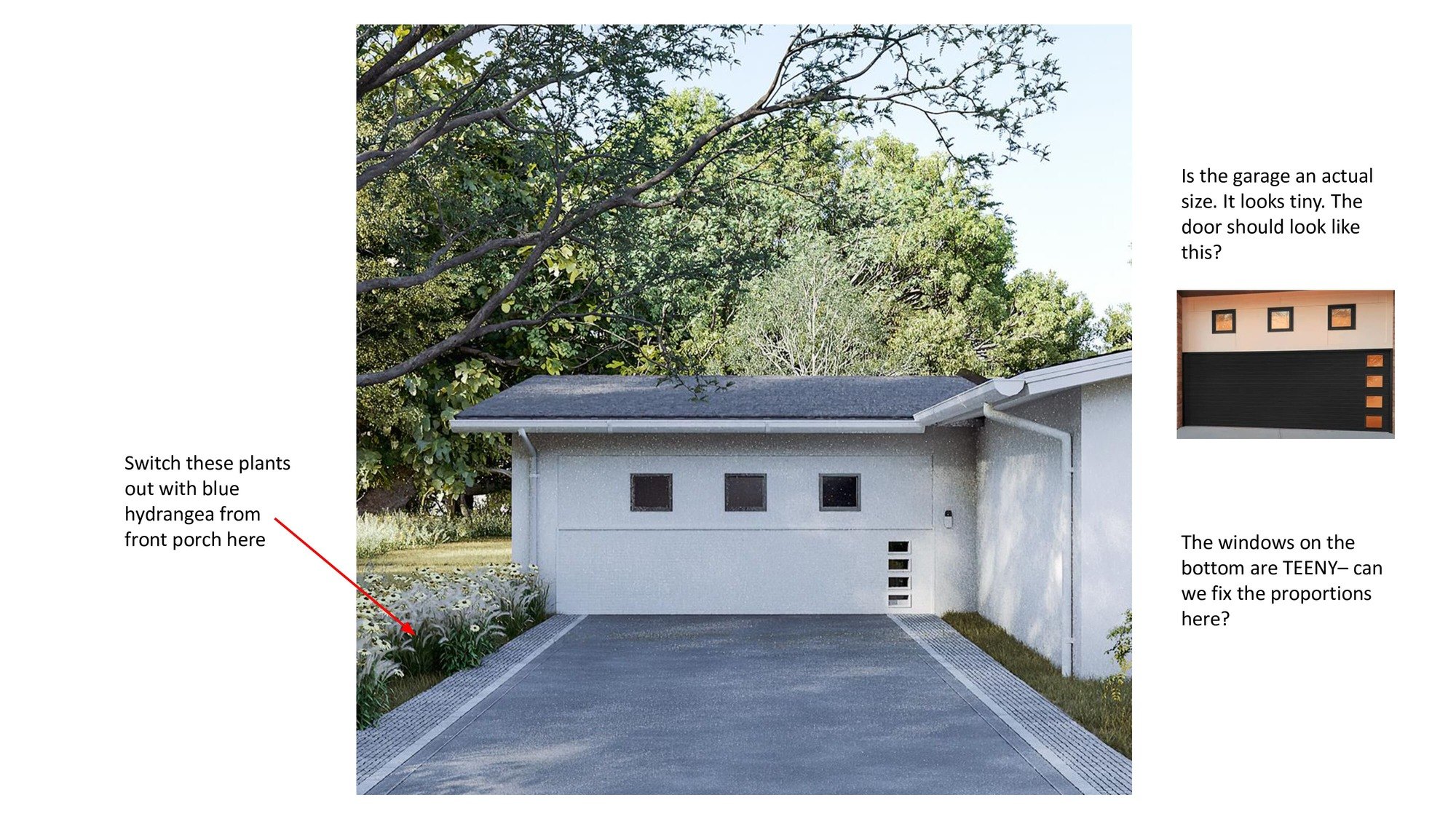 |
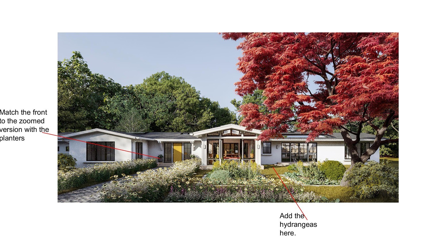
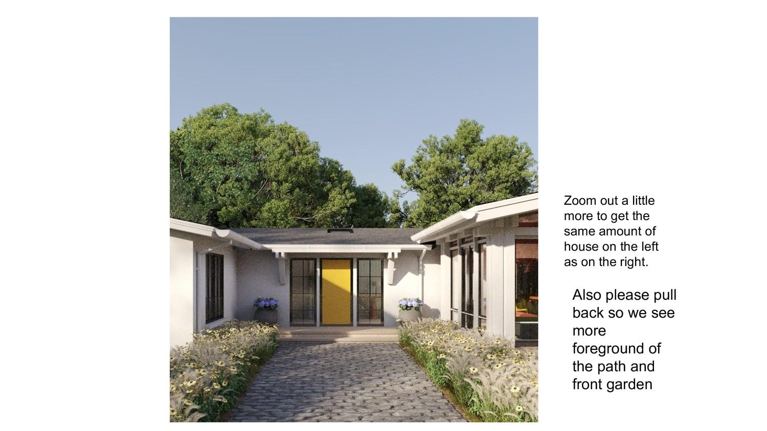
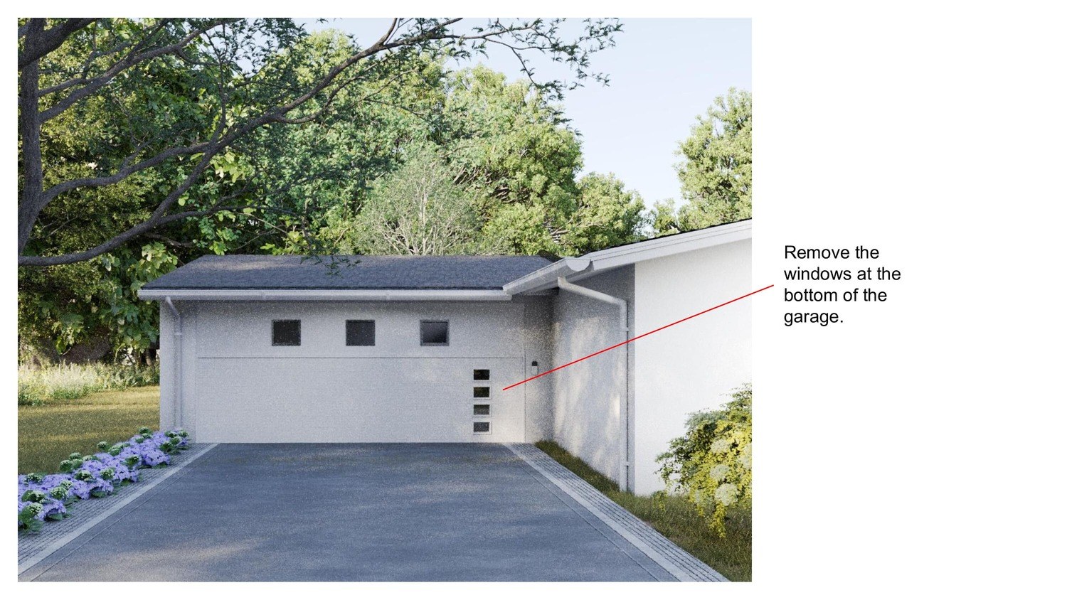
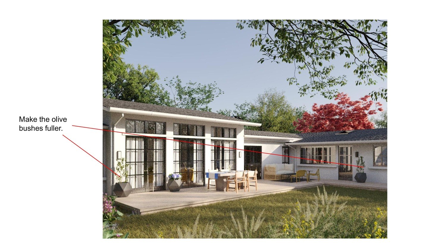
And again, as quickly as possible (we needed to complete this project on a tight schedule), we made the changes that we were asked for:
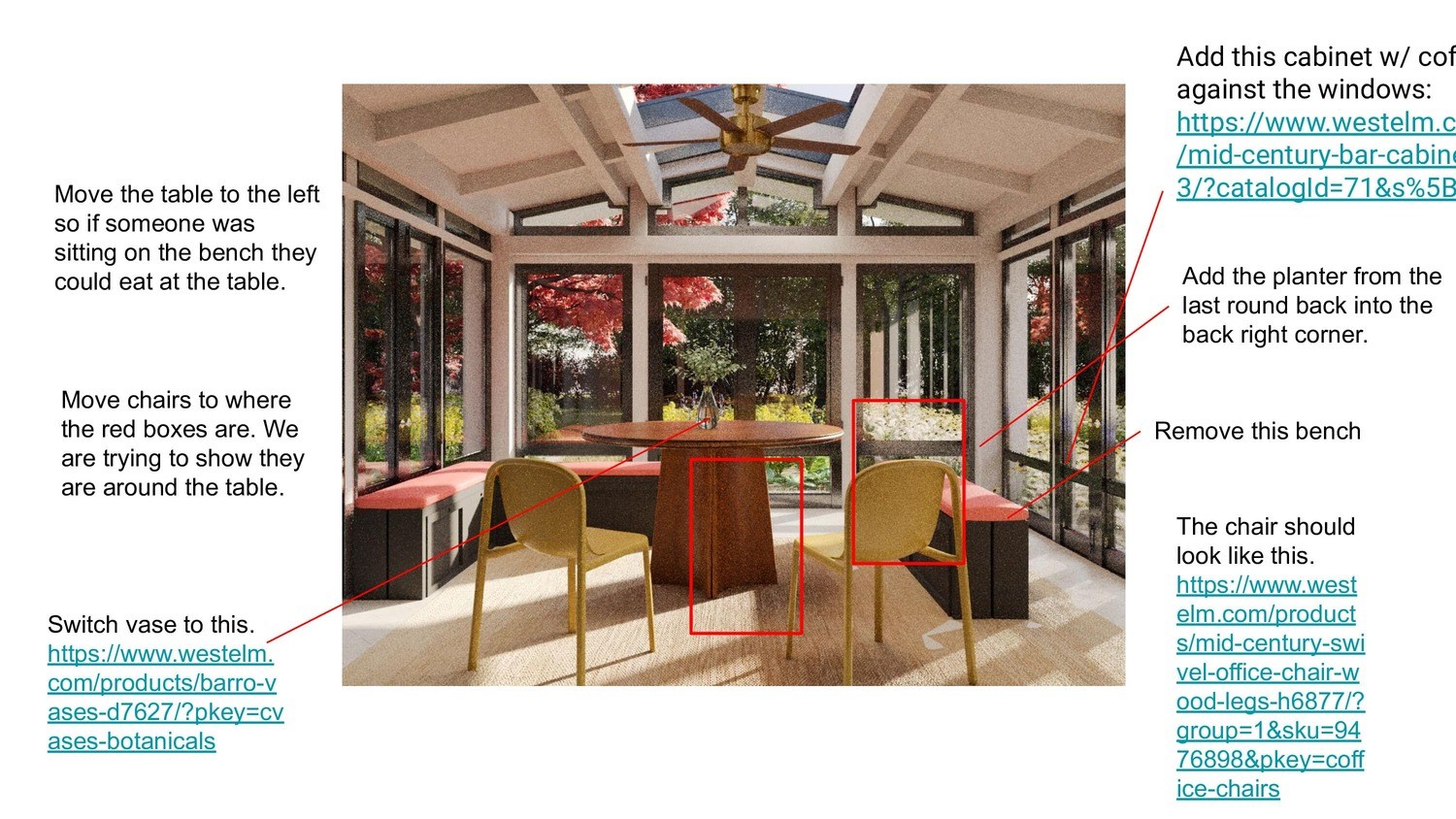
The client replied to us with a letter with new edits, but it already became clear from it that we were about to reach the final stage:
 |
 |
 |
 |
 |
Phase #6. Exterior and Interior 3D Rendering, Final Drafts
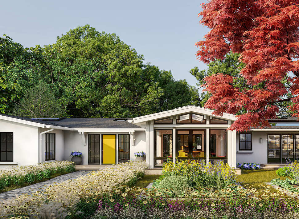
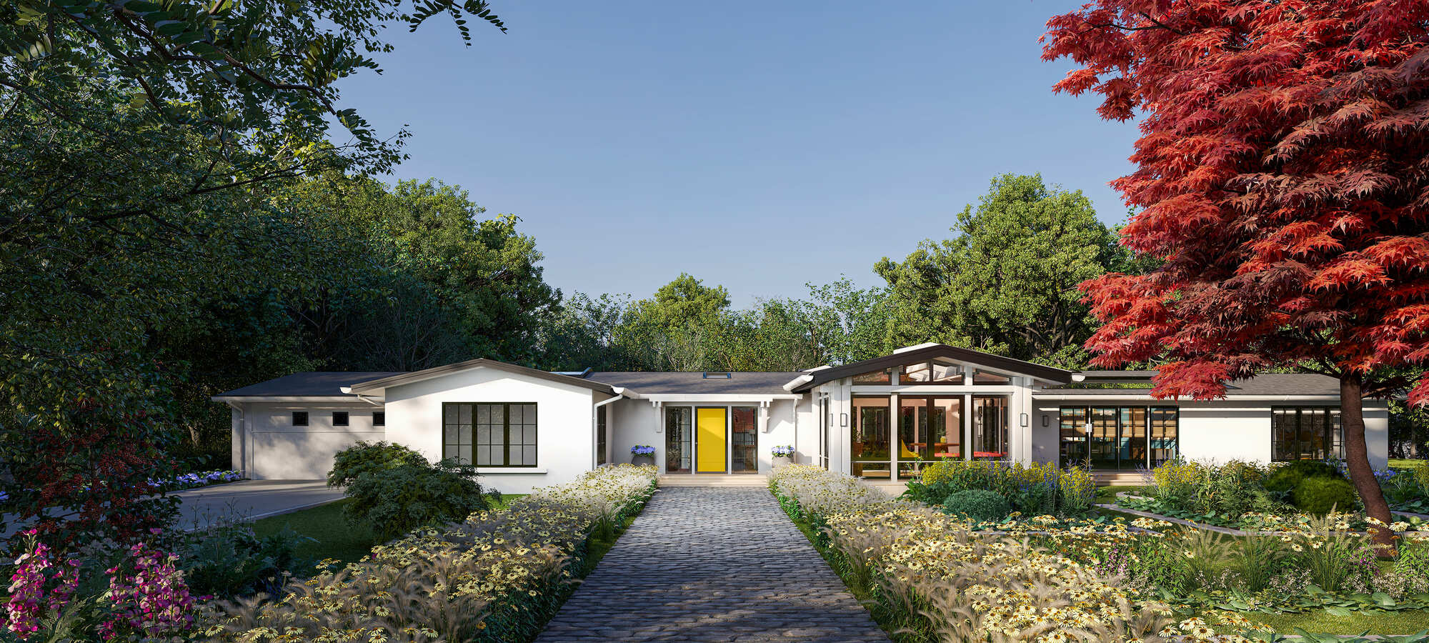
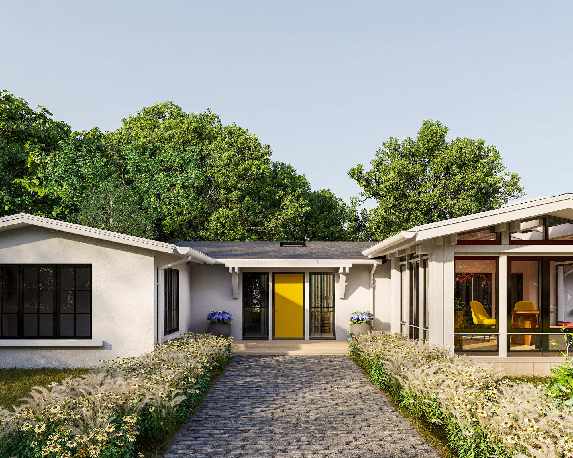
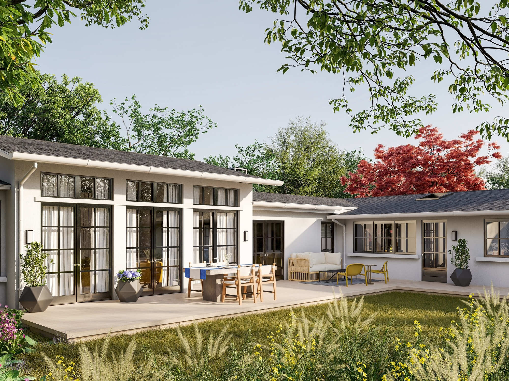
Because this was a huge project, if you're not mind, we'll skip a couple of rounds of drafts to show the final drafts of each room. Here's what we got after making all the changes to the exterior:
Exterior
 |
 |
In parallel with this, we received a new letter from our client regarding to the interior drafts:
"As we start to finish the remaining rooms before creating the 3D tour, I have made notes and changes in the document attached. Please make these changes and send them back to me".
After applying all the changes, we sent the renders for the final check and approval.
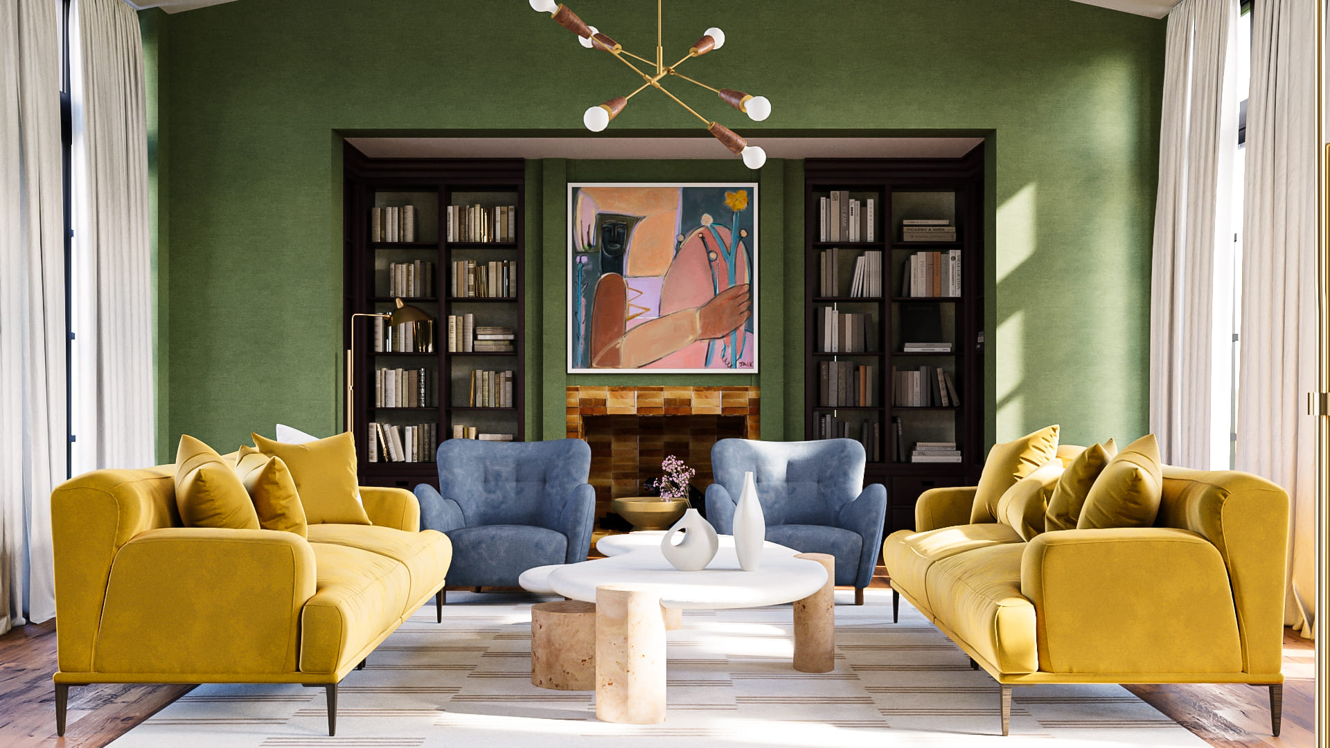
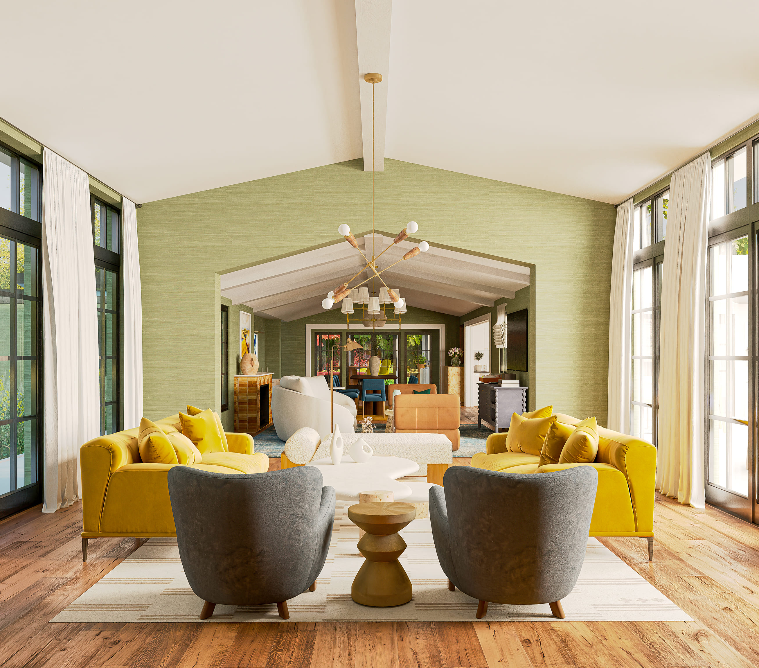
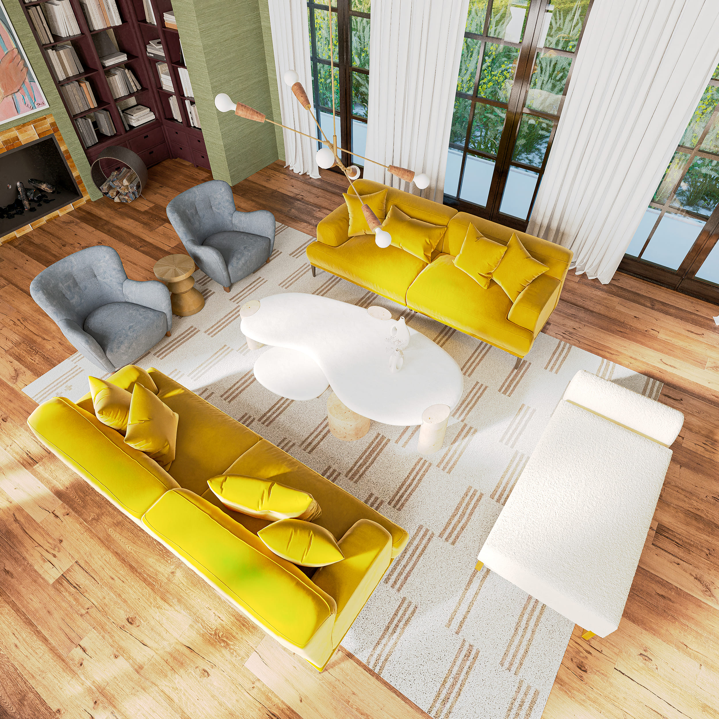
Great Room
 |
 |
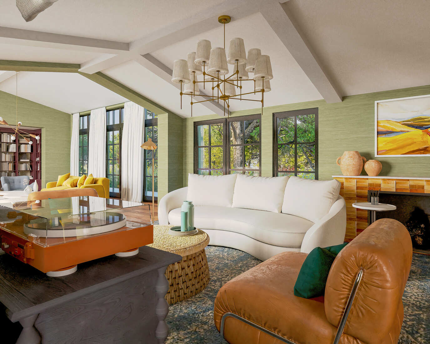
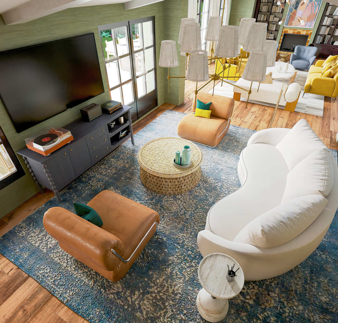
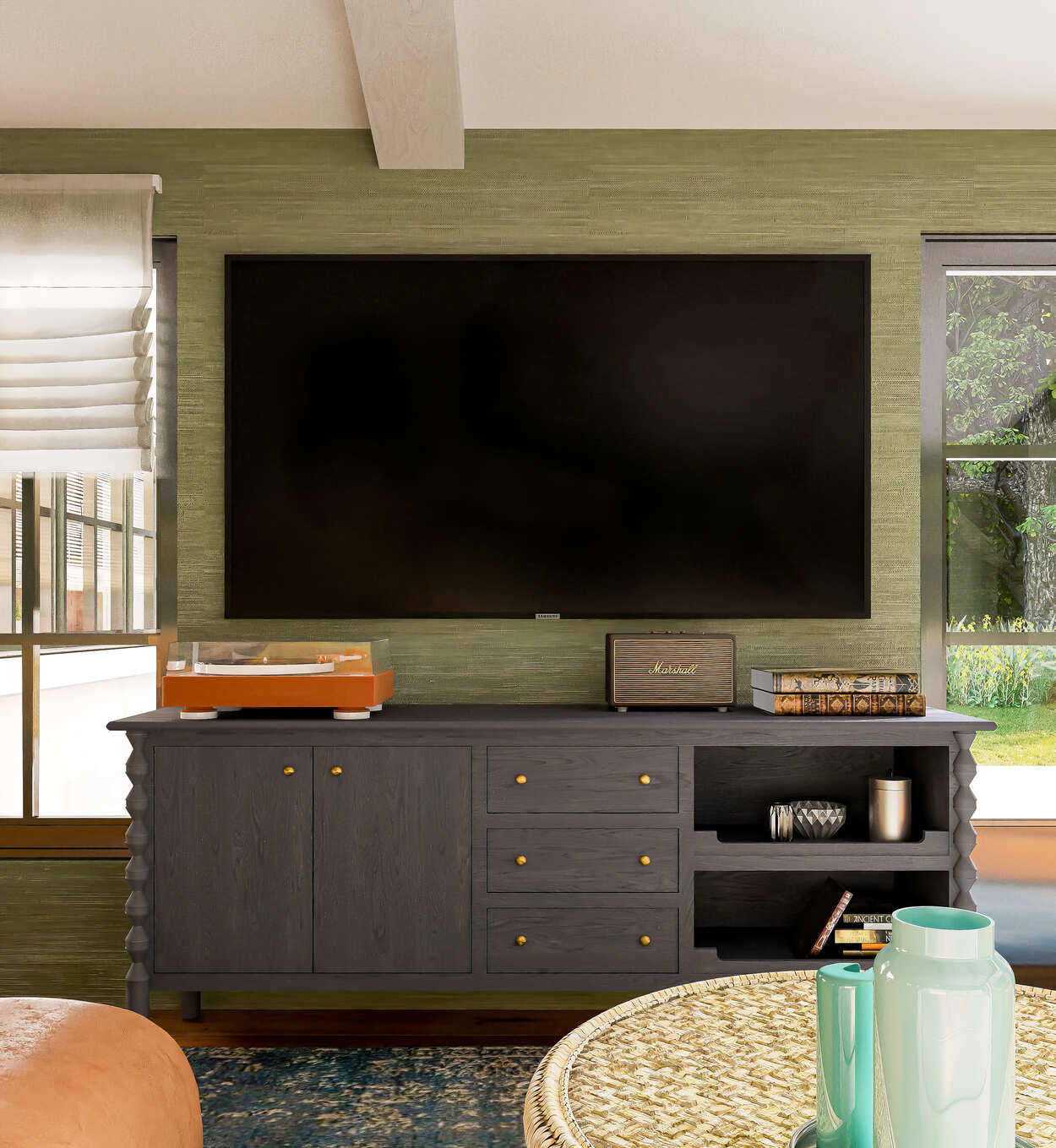
Media Room
 |
 |
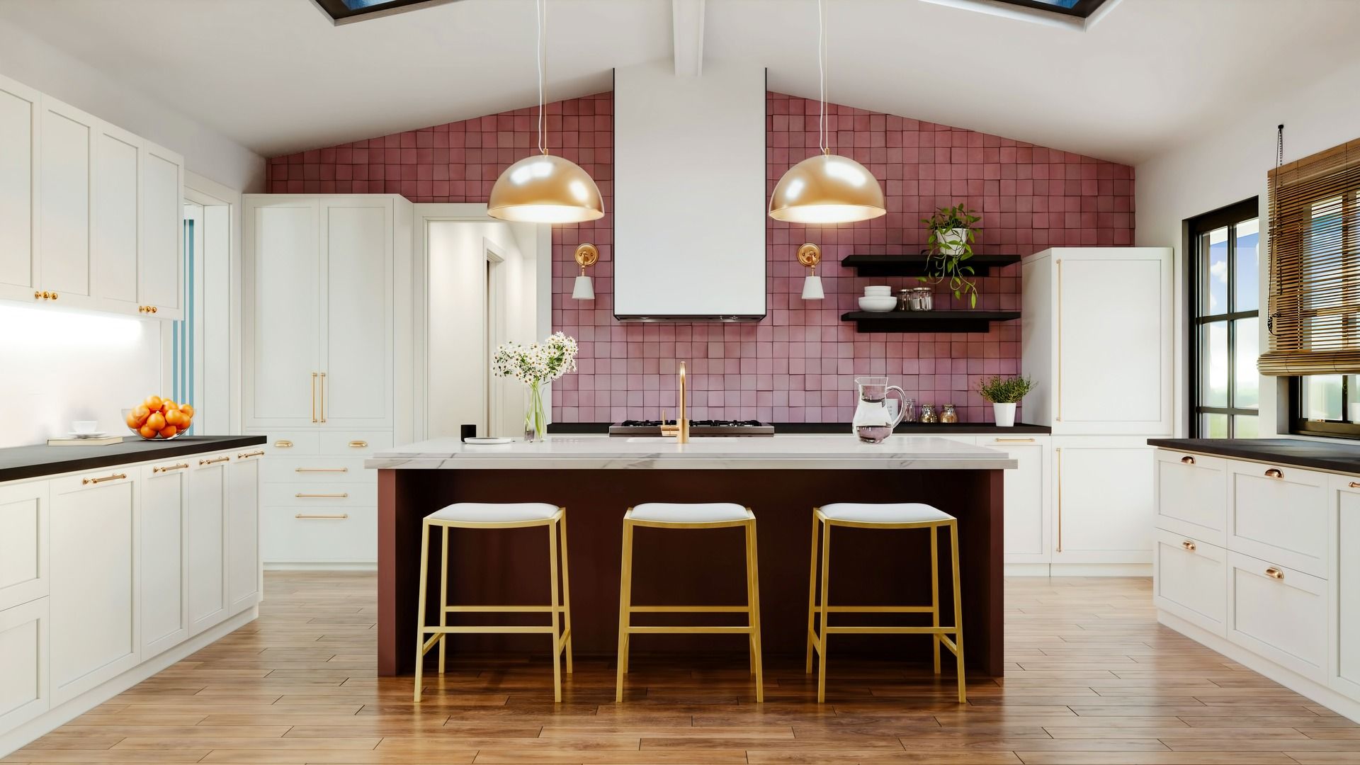
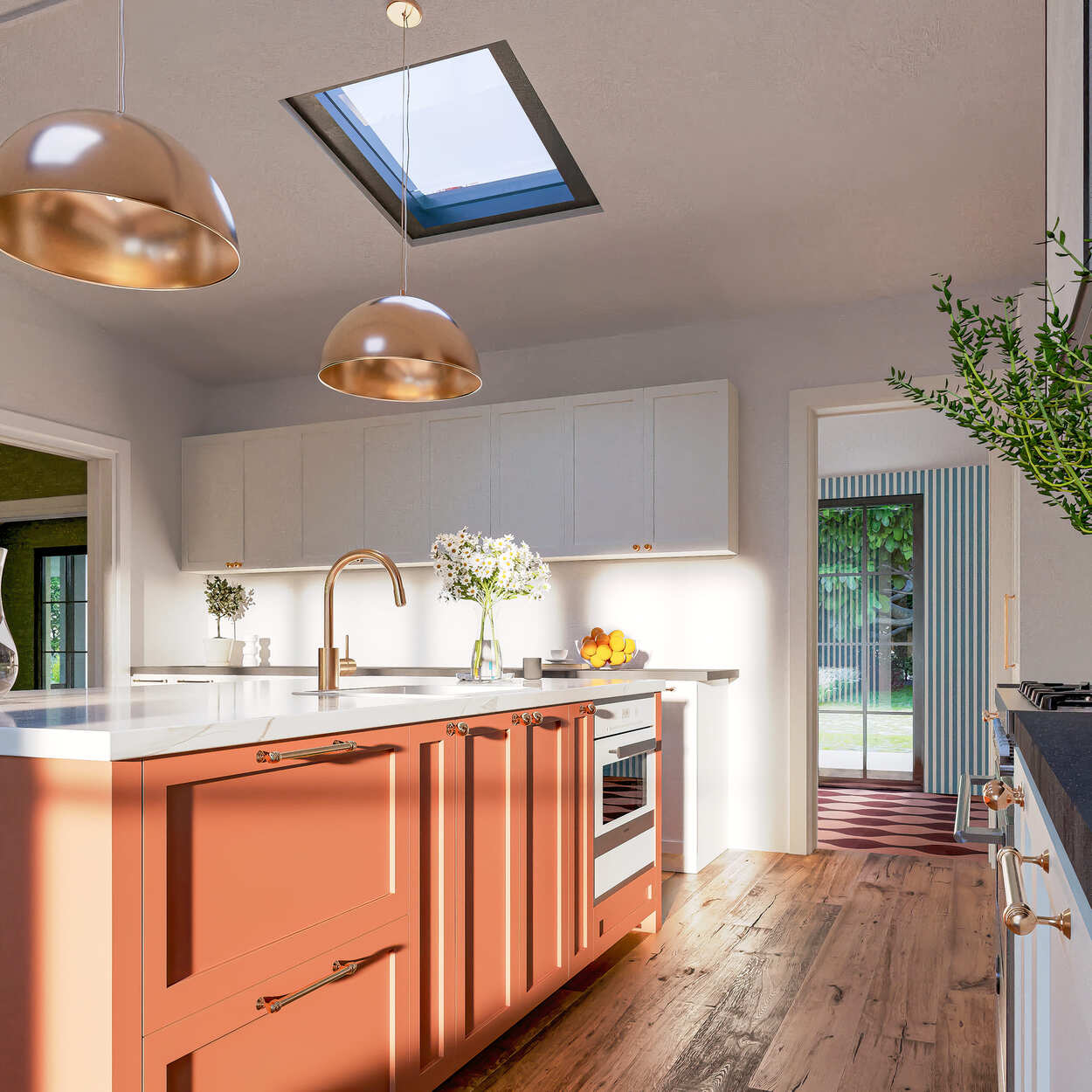
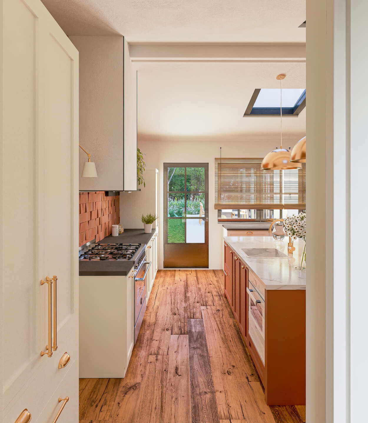
Kitchen
 |
 |
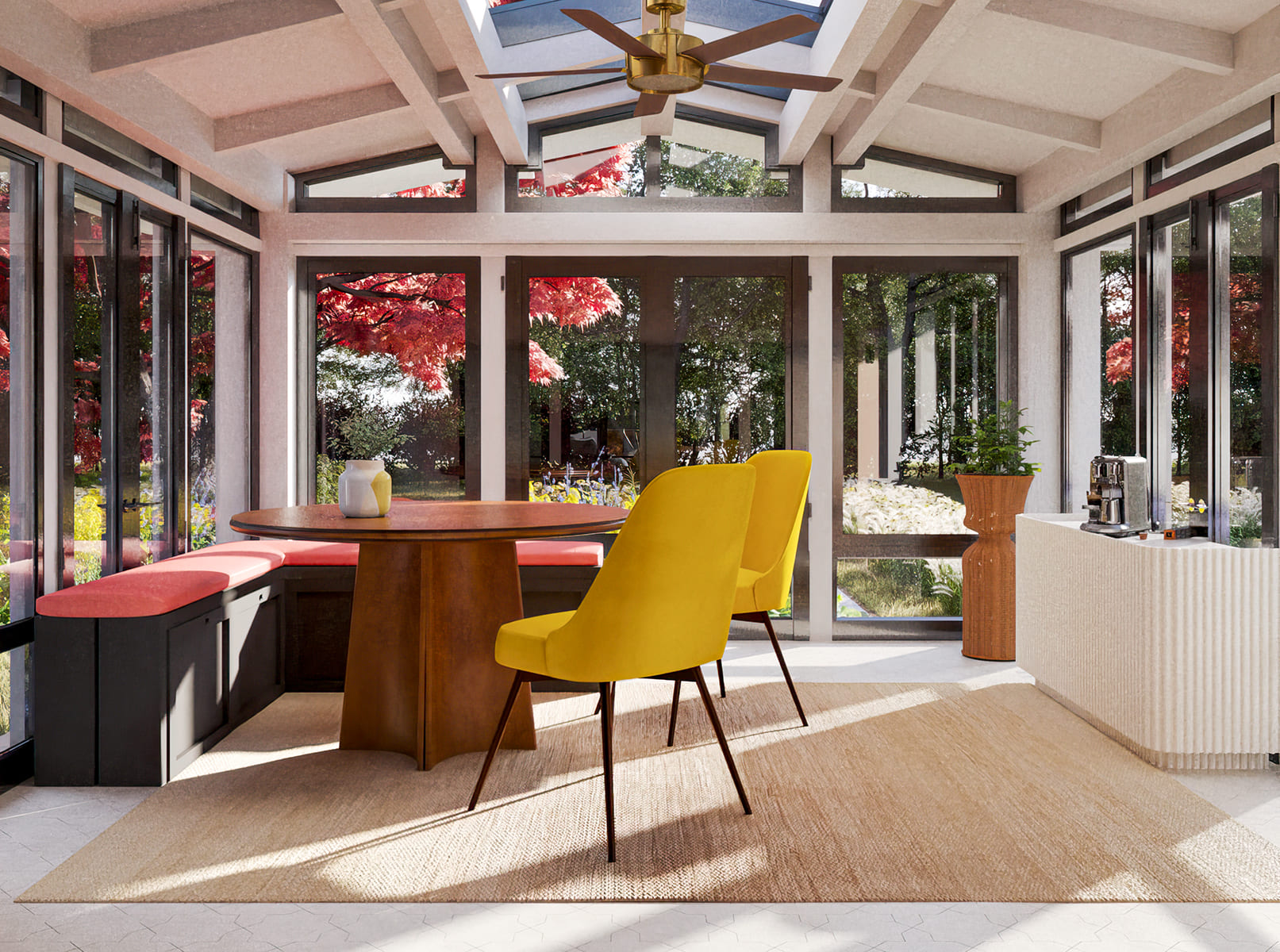
Breakfast Room
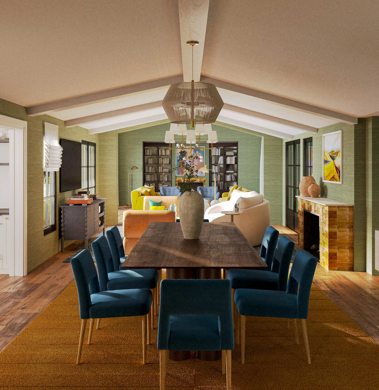
Dining Room
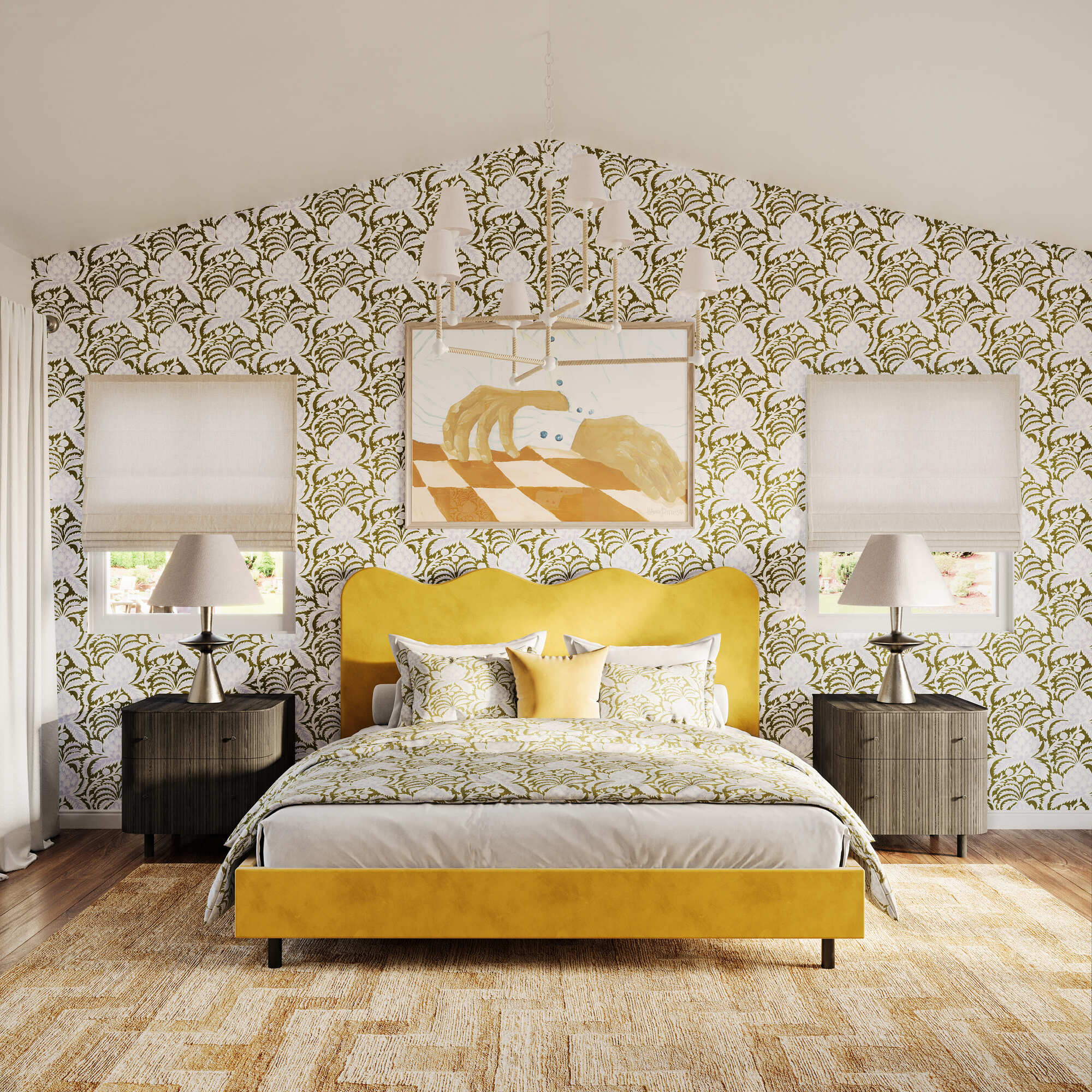
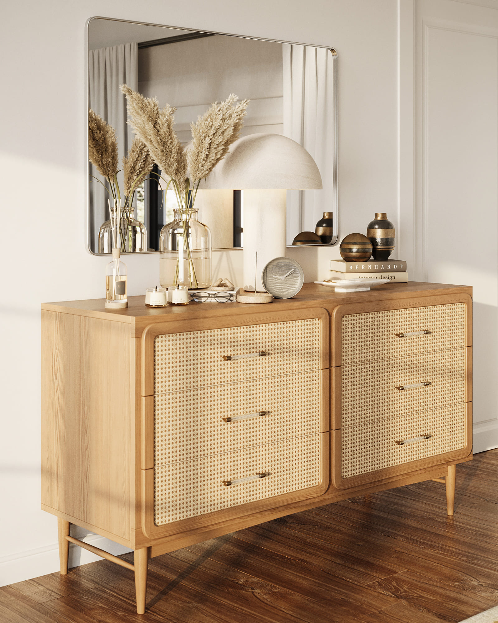
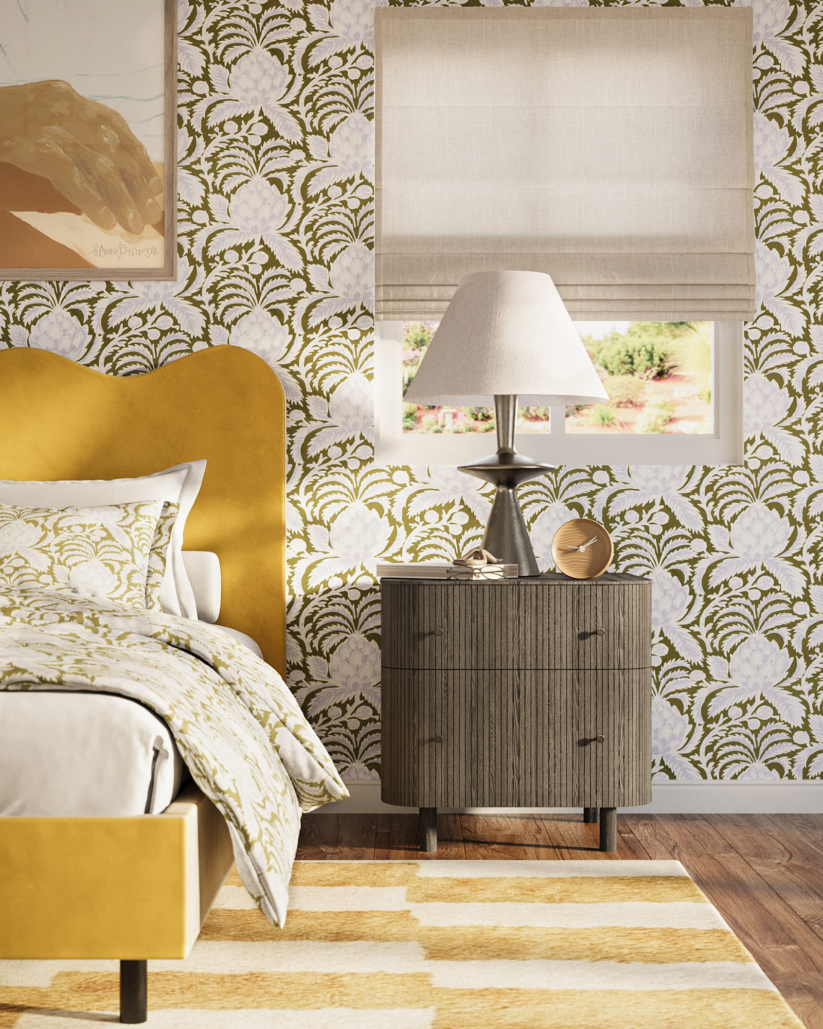
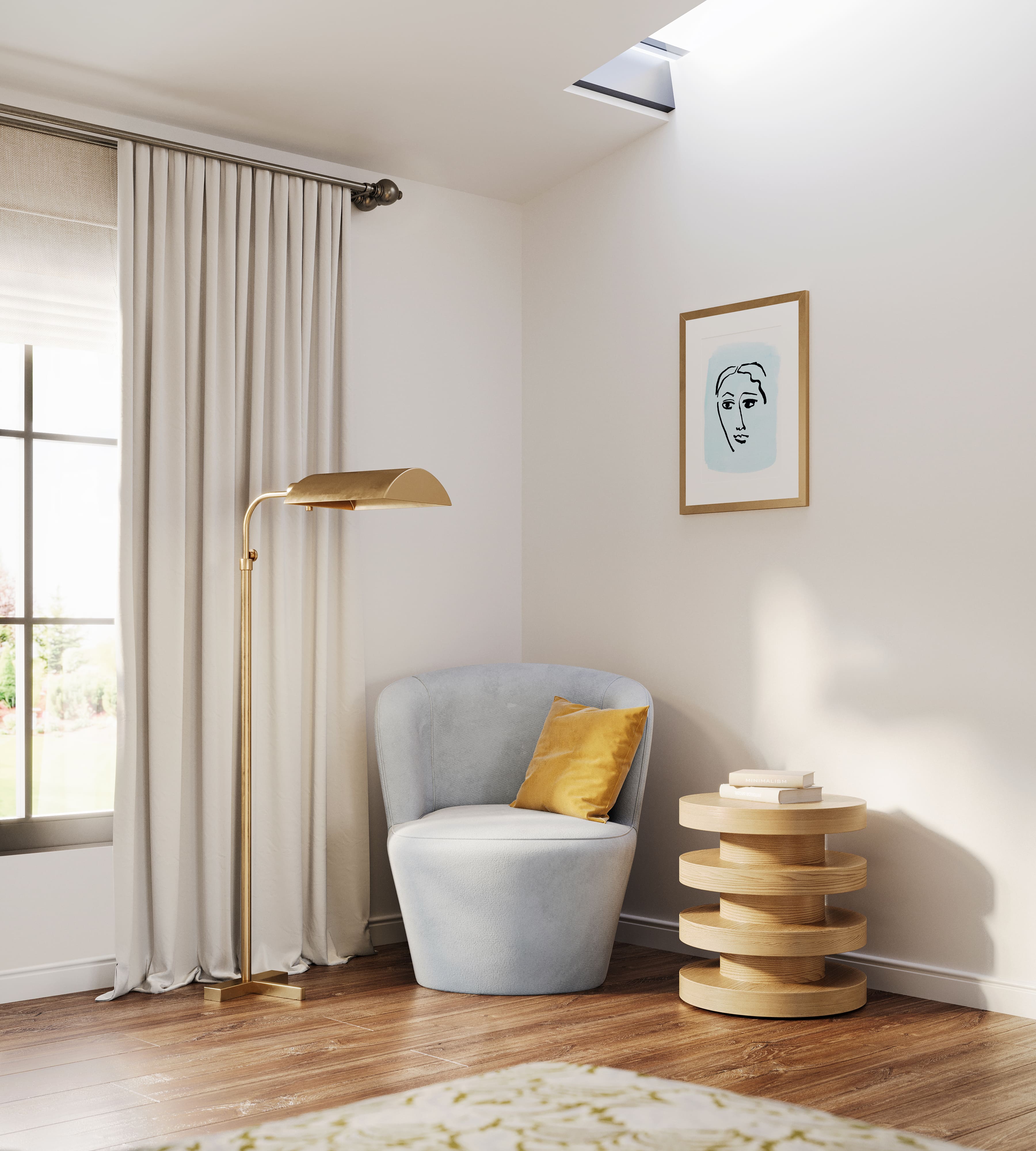
Bedroom
 |
 |
 |
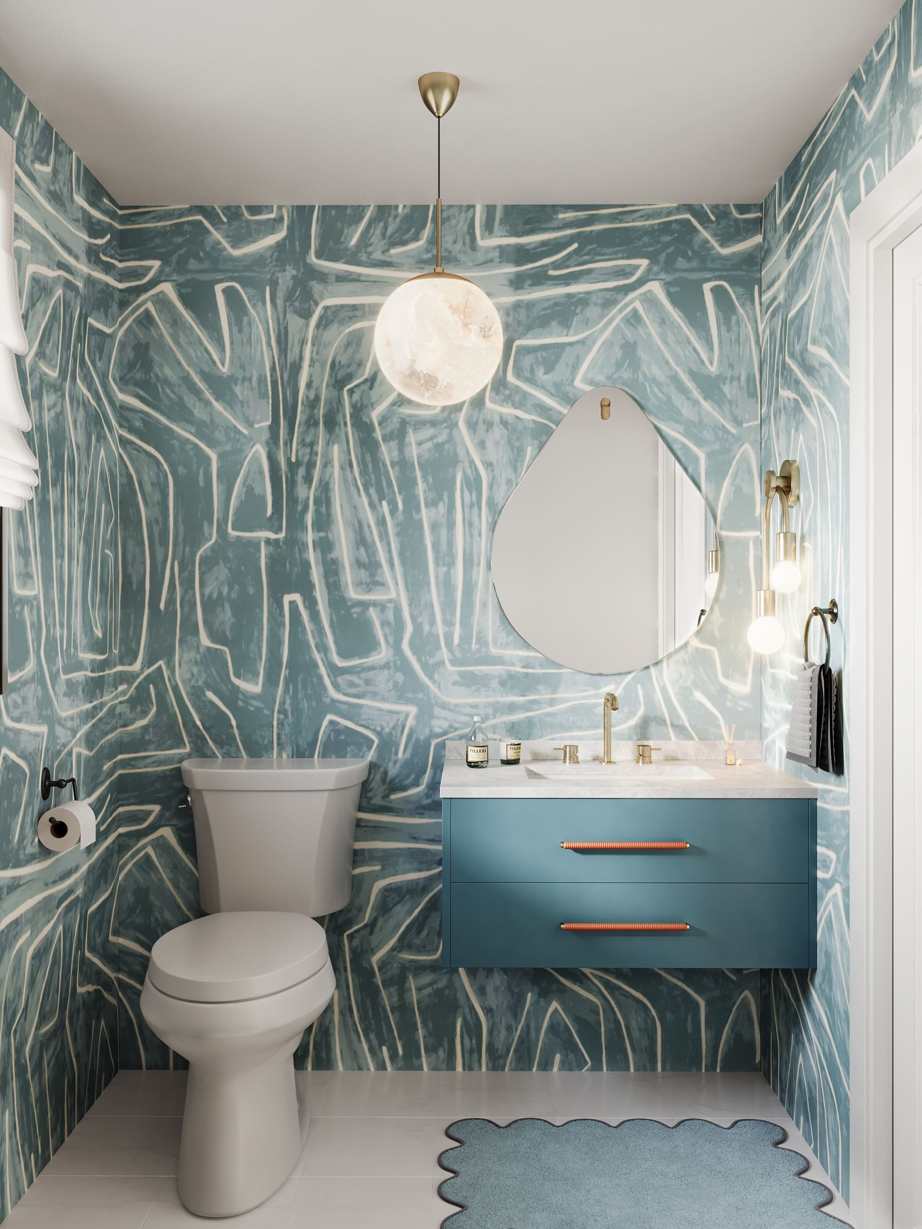
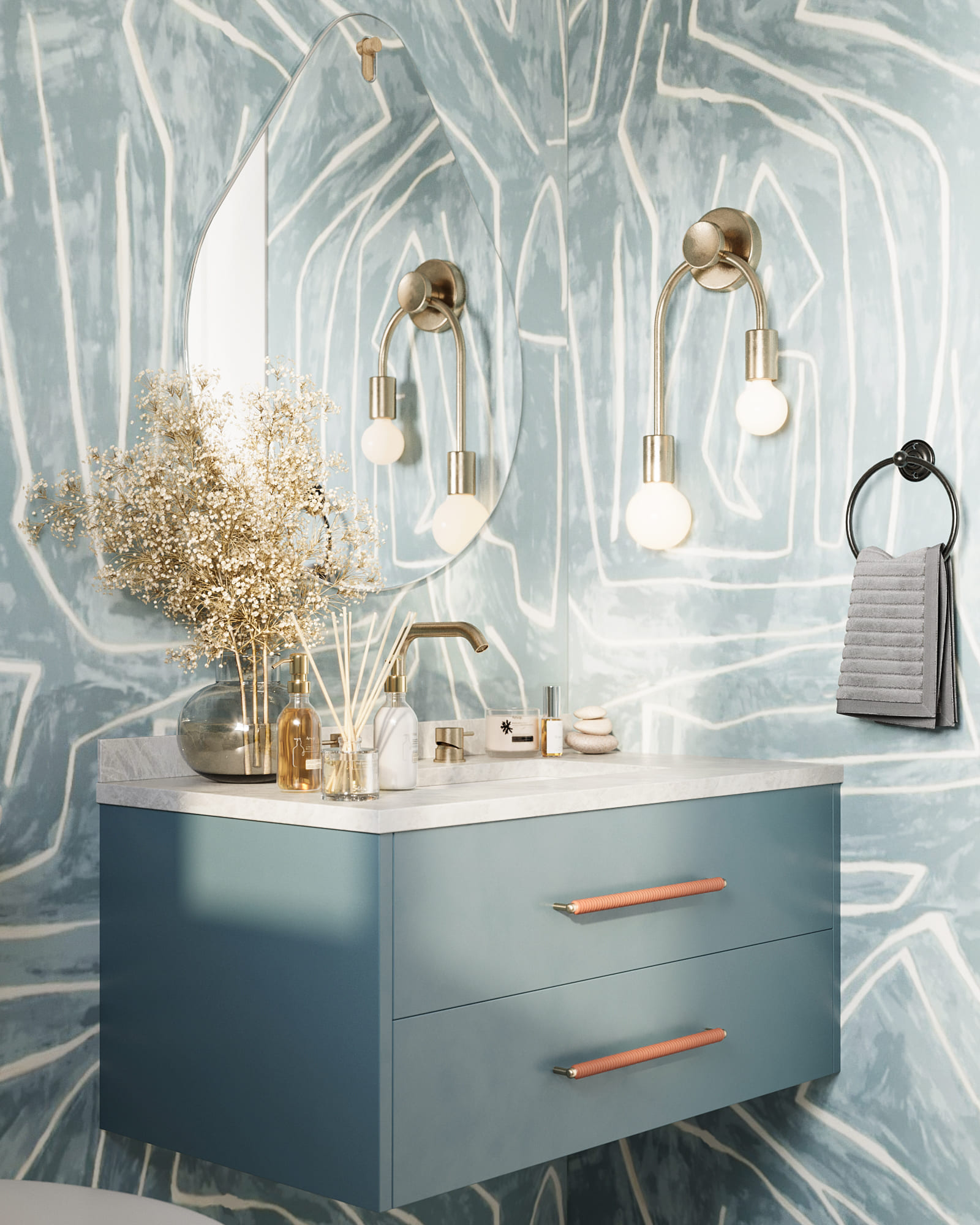
Powder Bath
 |
 |
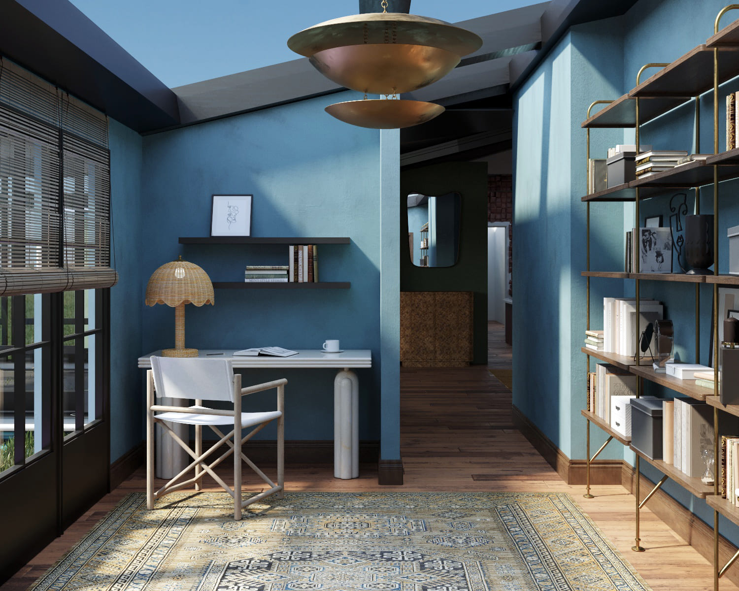
Office
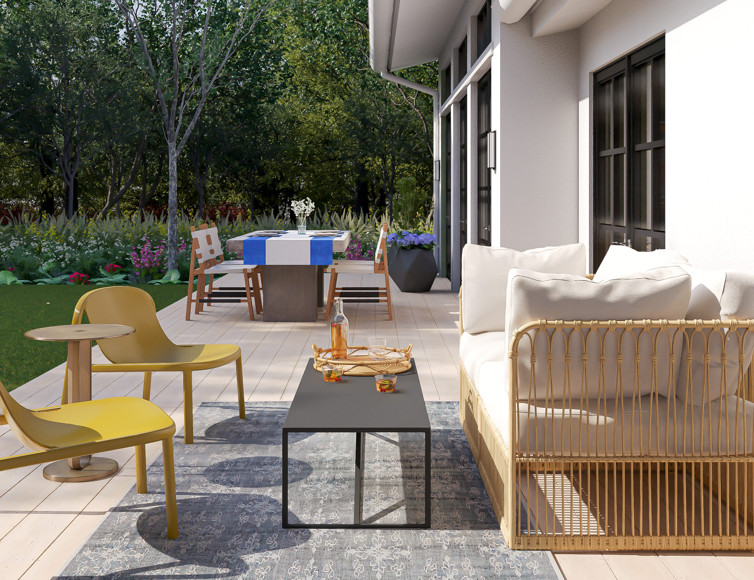
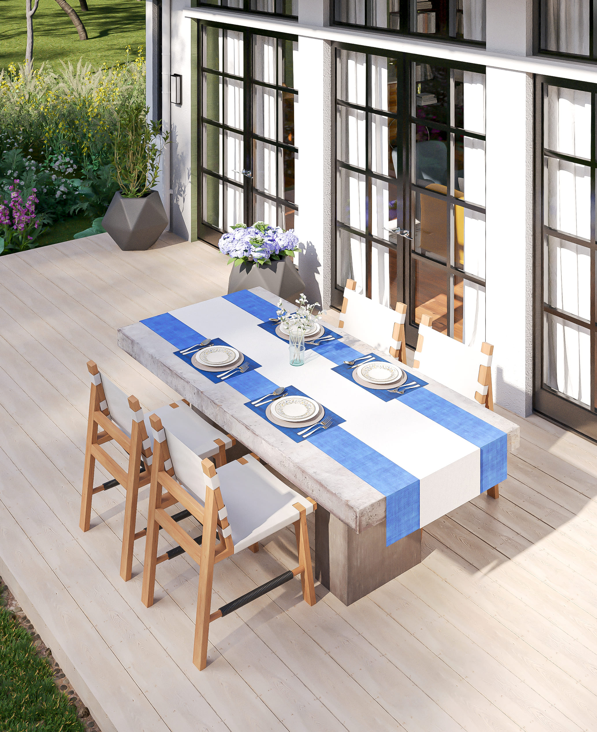
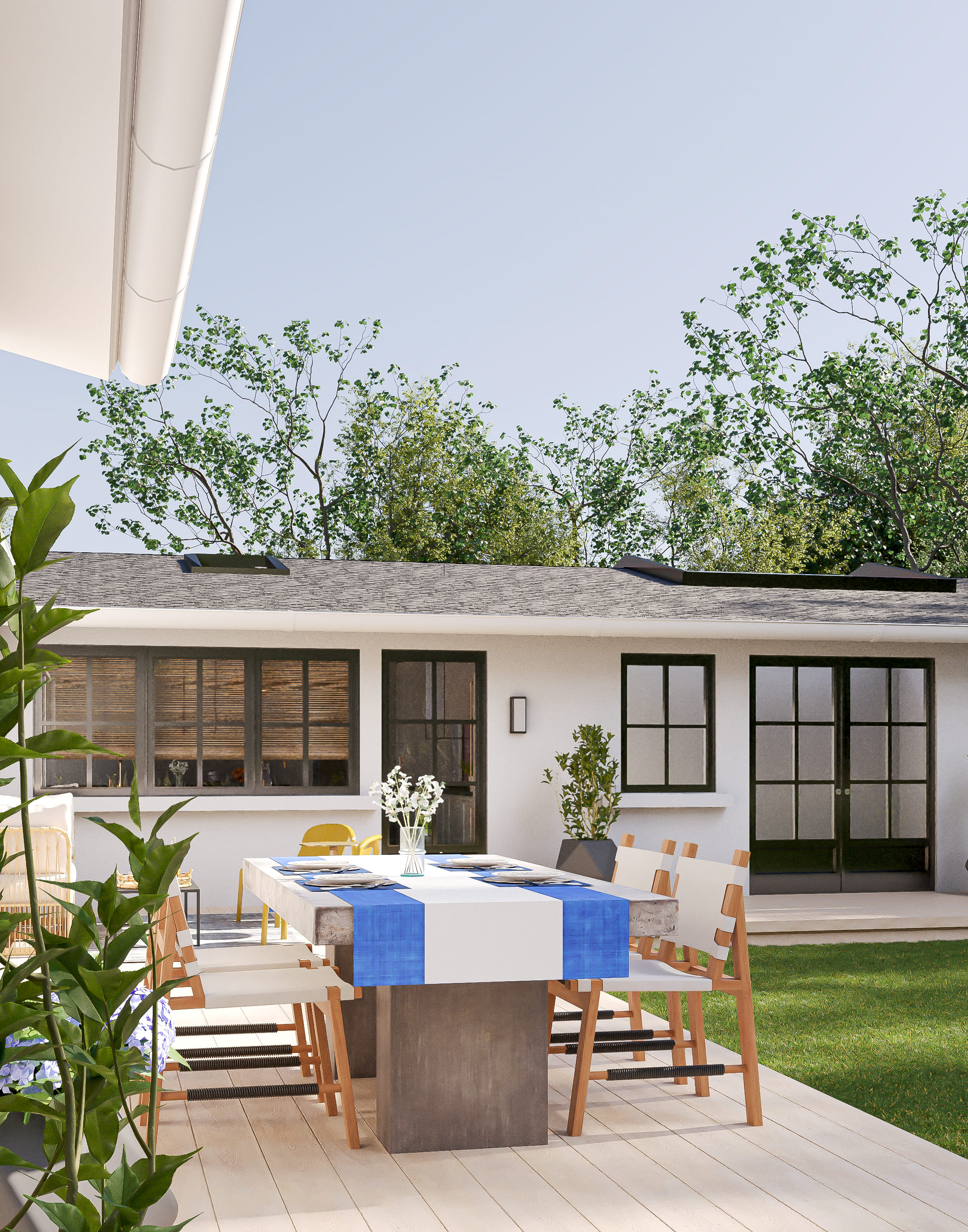
Patio
 |
 |
Rooms are ready, let's prepare the tour!
Phase #7. Preparing the Virtual Tour
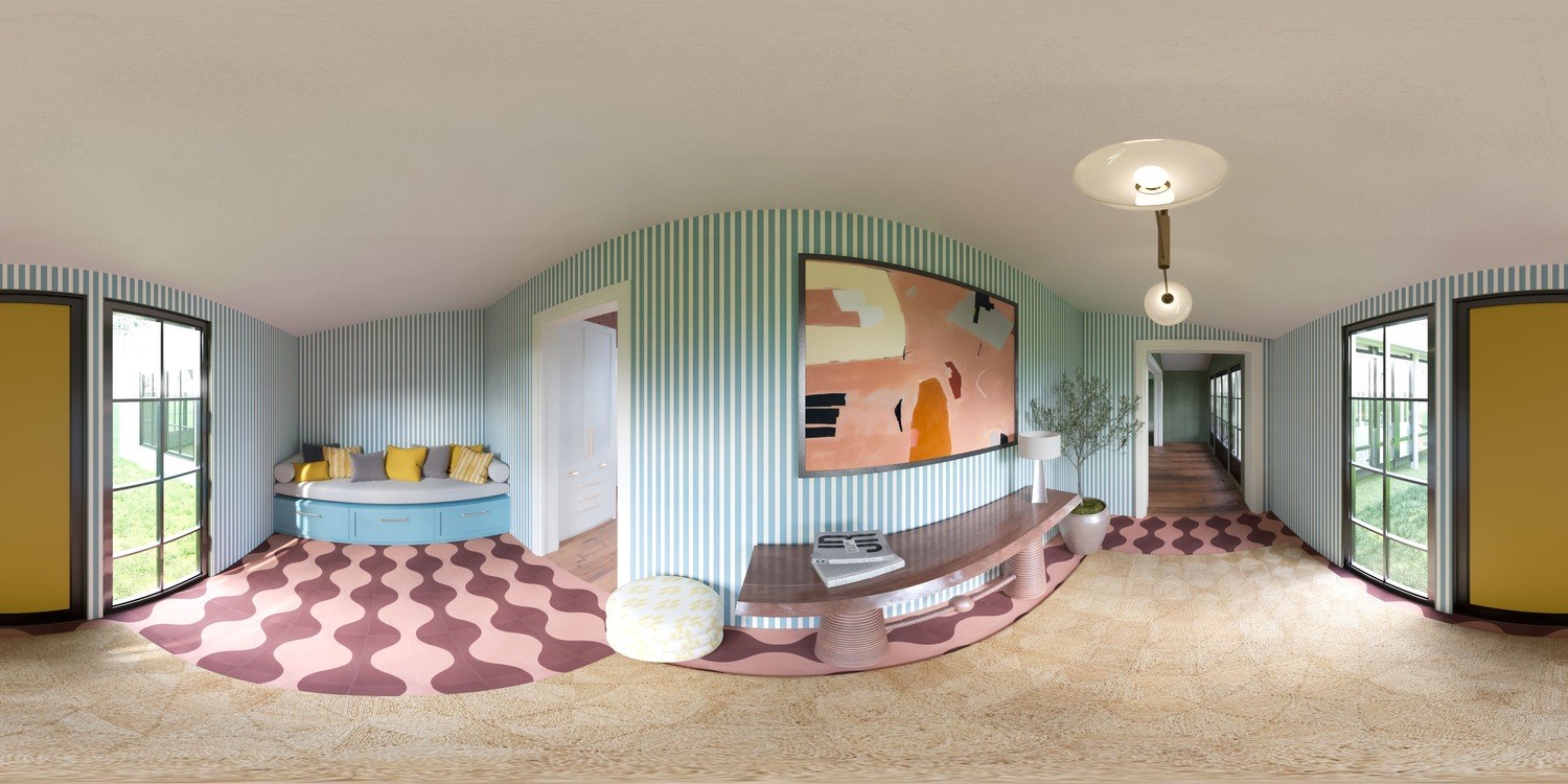
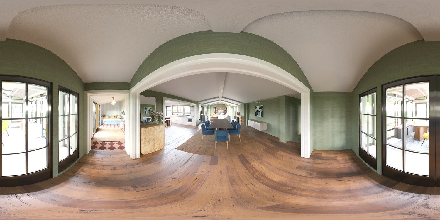
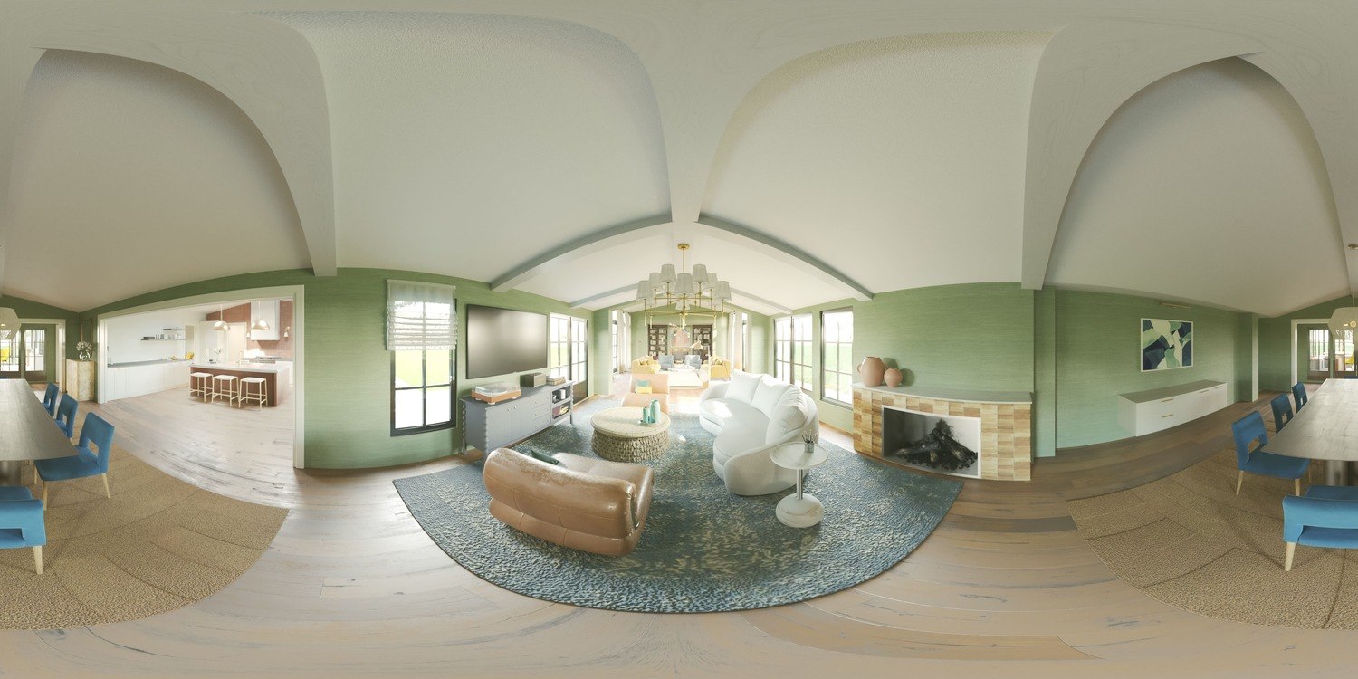
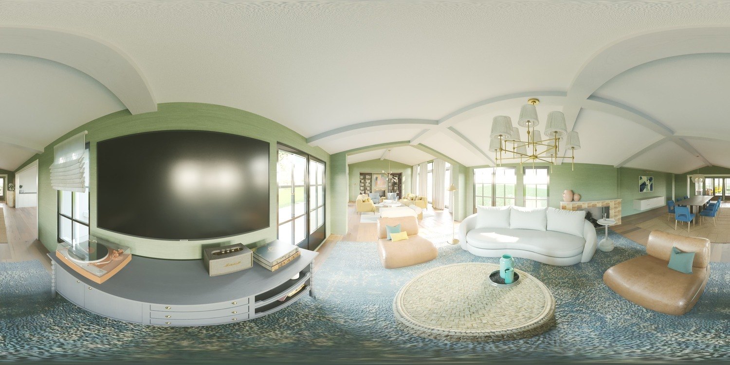
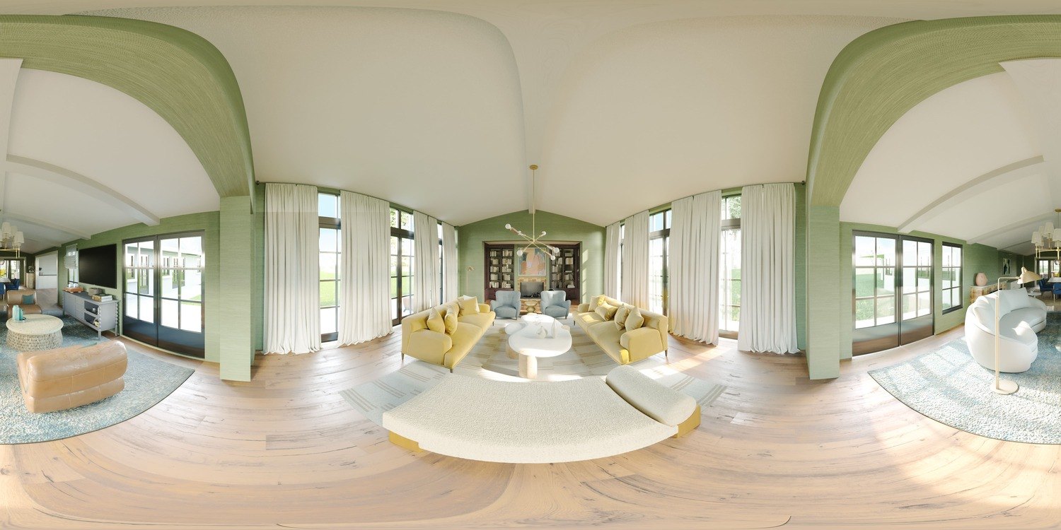
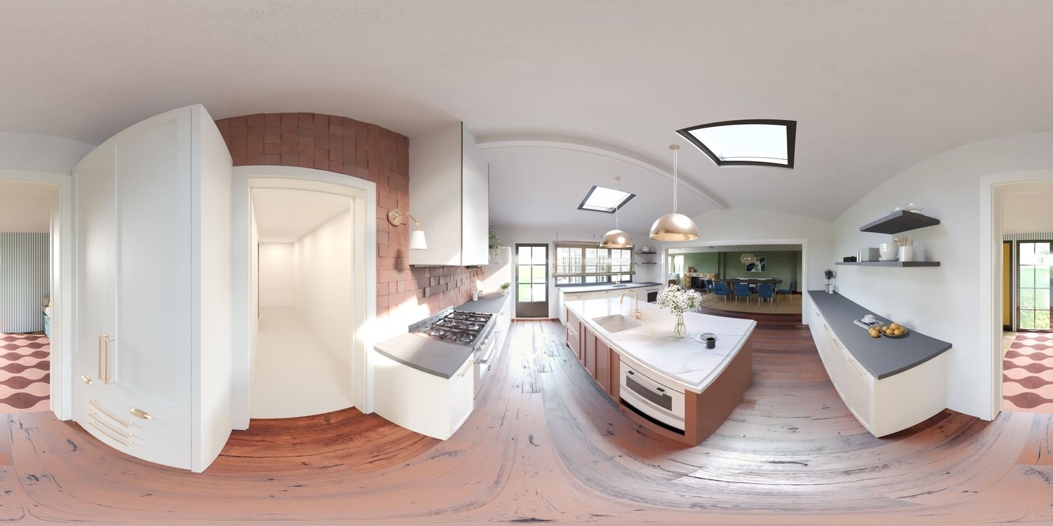
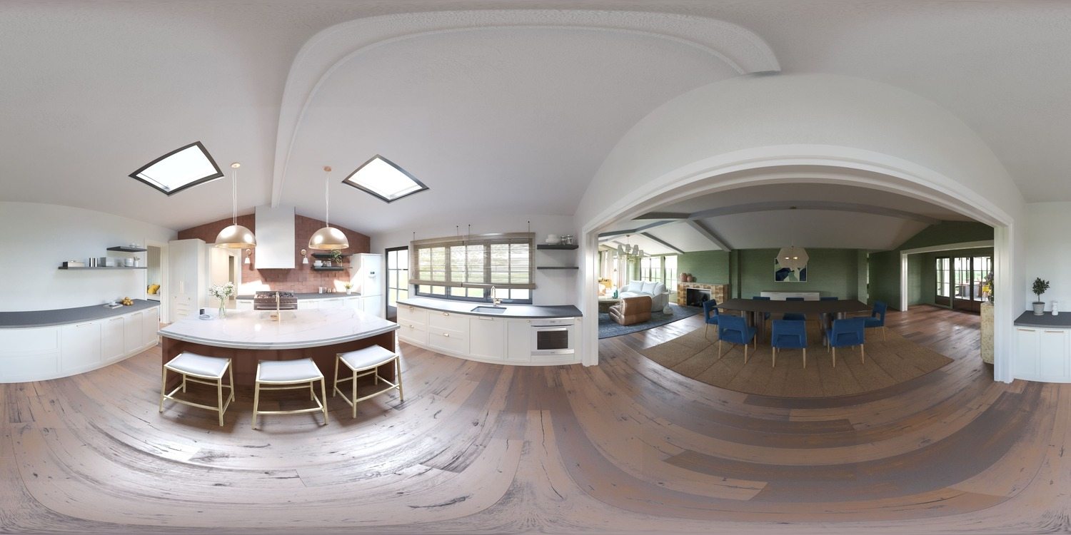
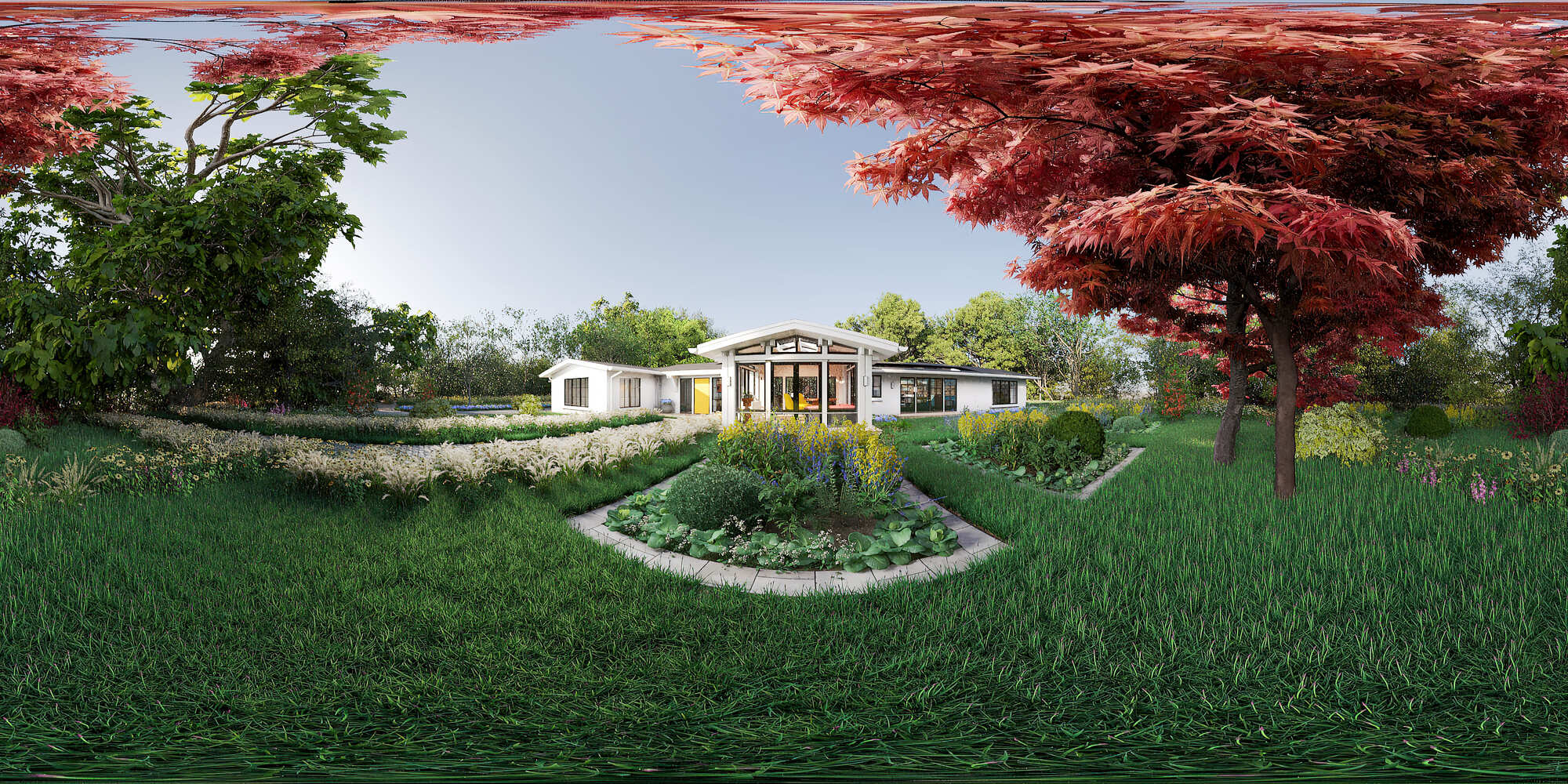
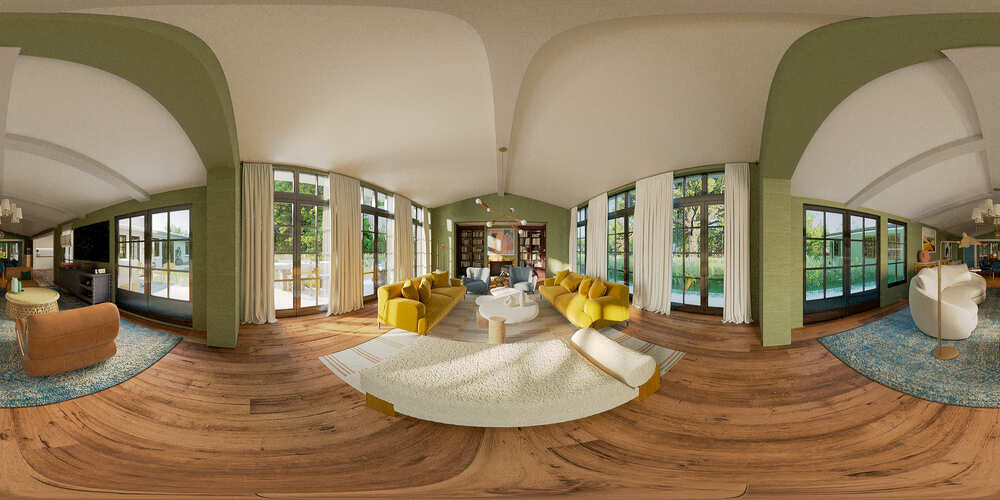
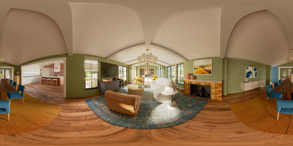
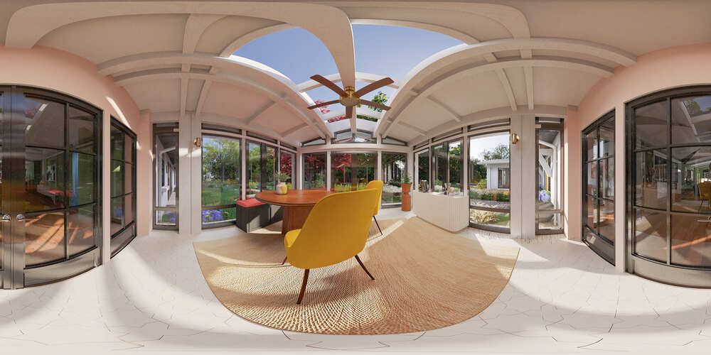
We needed to add all the created pictures into a 360-degree virtual tour. This phase starts with creating 360 Panorama Renderings for approved viewpoints. Once those viewpoints were approved by the client, we jumped into this stage, crafted the first panorama renders, and sent them to the client for feedback! Here are few.
 |
 |
 |
 |
 |
 |
 |
And we got the most positive feedback we could hope for!
Client wrote:
"Overall, this looks amazing. We have a few comments below and also in the link below.
- The landing points in each room are too up close and high. Can you have the designer pull back to eye level?
- The coloring seems muted throughout the house. Can you make sure to match the coloring on the final images that were created?
- The fisheye looks extreme, which distorts the proportions of the products. They may be fixed if the tour is pulled back slightly.
- On the floor plan icon, can you have it read floorplan versus the cubes? We want the screen to mirror last year.
- Can we have a point where you can see the full house before you enter?"
When we changed the height of the cameras, did the color correction, and made all the other changes, we got this. Here are just some of the viewpoints.
 |
 |
 |
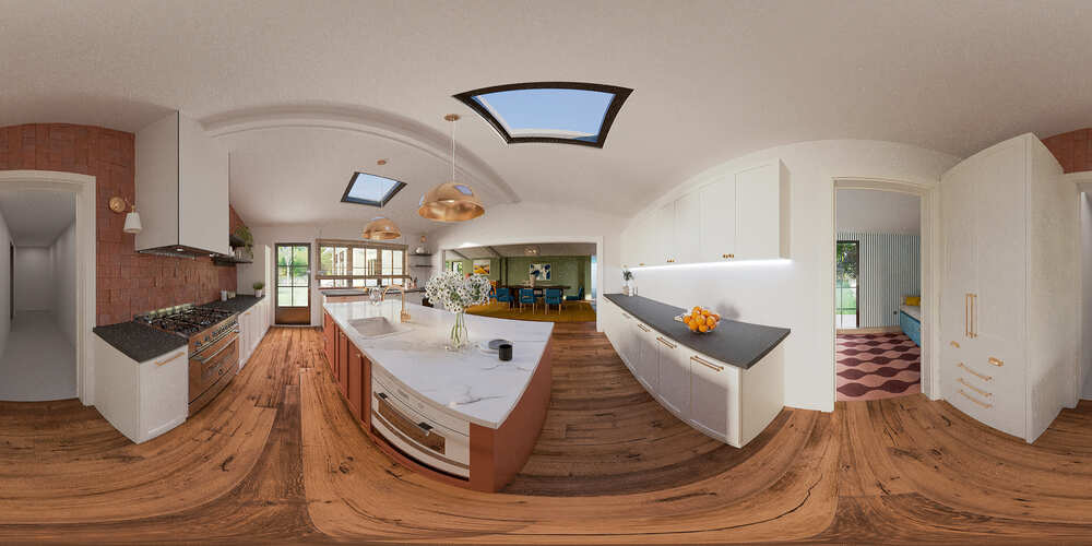 |
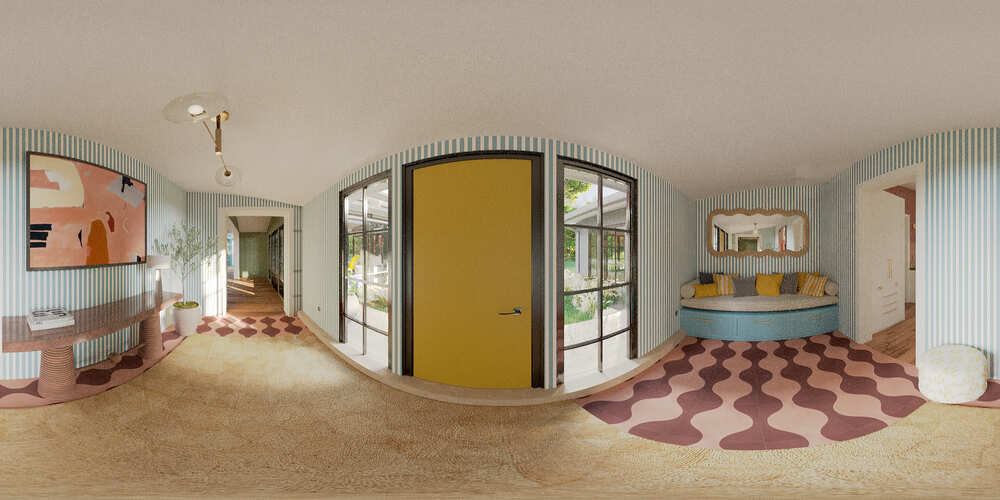 |
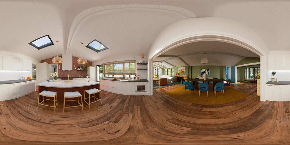 |
Phase #8. Creating the Tour and Adding Hotspots
Upon creating the 360 Renderings for all the viewpoints, we tied them all together to create a virtual tour. Then, we started to add the most crucial part of any virtual showroom - the hotspots! Hotspots are clickable active spots on a virtual tour that trigger a certain action.
These hotspots can be transitions between rooms/panoramas, price tags with product descriptions and links to the seller's product page, and any kind of other info bars with text, image, or video format. For example, here is the hotspot for an entry:
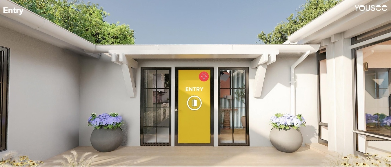
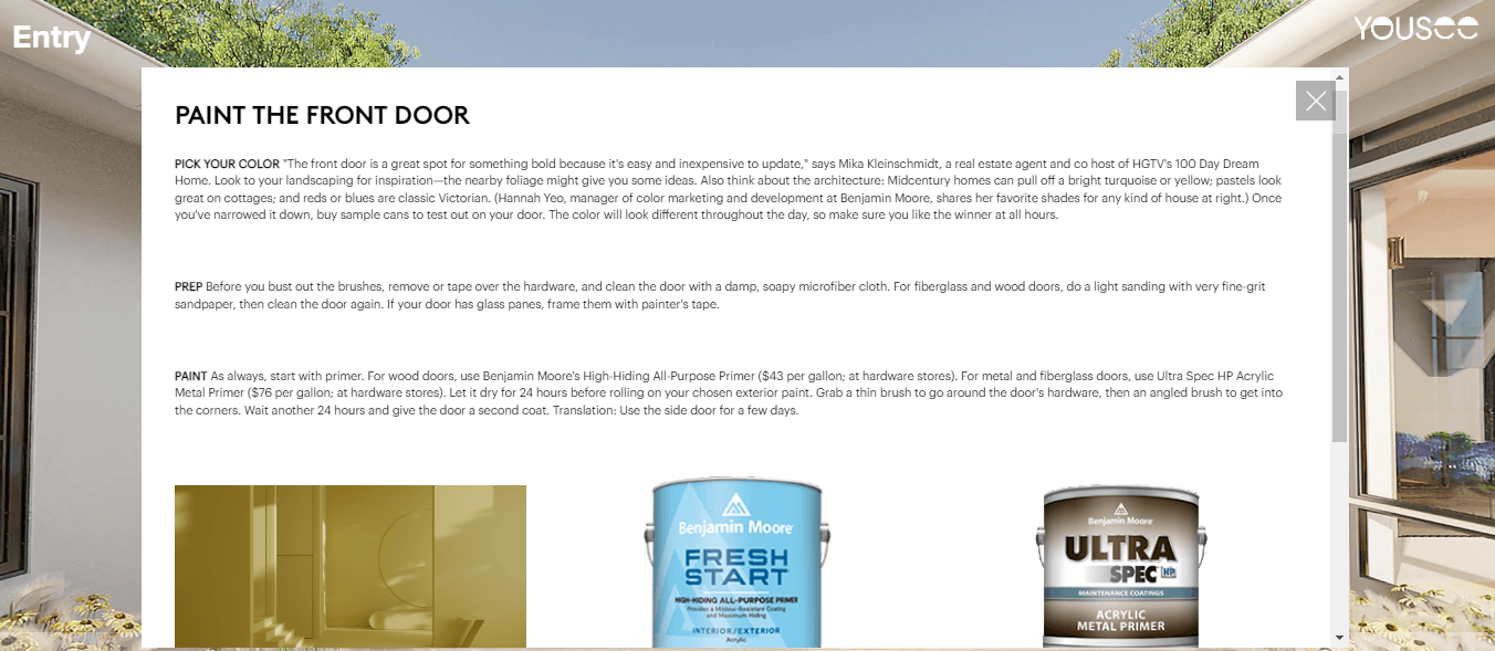
Such hotspots are an important part of a virtual showroom. They allow the client to better navigate the variety of products and receive maximum useful information — and thus demonstrate the store's concern for the client.
So we compiled a virtual tour from this, added hotspots and required text information, and sent the link to the client. And hooray: our tour is finally ready!
The result is fantastic: the living building of the virtual showroom fully copes with the task for which it was created. Such a virtual showroom allows the buyer to immerse himself in the shopping process as much as possible and see how this or that element will look in reality. We strongly believe that the future of online shopping lies with these virtual showrooms.
Doors are open, come on in and take a Tour of Real Simple's 2023 Get It Done Virtual Home!

